Create a Platform Agnostic Design System
My role
I was hired as consultant, to conceive, create, & handover a unified design system. It should be utilised by any platform, in-house teams, distributed teams & third parties, to create consistent designs that could be built using tech that would adhere to the same unified standards.
I initially headed up a team of 4 made up of permanent staff & myself.
It was an open brief.
Results
A single source of truth for all front-end design at N Brown, comprised of:
Documentation website, which was used to create
- Sketch component library
- CSS framework
- React component library
The design system, documentation & overall concept have been a catalyst for cultural change. There are fewer UX design silos, therefore less duplication & more efficiency. The UX team adopted the system, it’s owned and directed by them. simplybe.co.uk has been completely rebuilt, and re-launched with a headless frontend built with next.js and react, the new experience is based upon the design system in this case study.
Background
N Brown is a Top 10 Clothing & Footwear Digital Retailer (based in Manchester) with a number of platforms maintained by in-house teams, distributed teams & third parties. Each platform is multi-brand, including: Jacamo, SimplyBe & JD Williams. Over time the look and feel across brands/platforms became inconsistent & difficult to maintain. Multiple pattern libraries existed in parallel, when there should have been a single over-arching component library provided as part of a design system. There were pattern libraries, yet no documentation on how to use them, resulting in a misuse of sorts. Stories were created in silos, duplicating design and development effort, resulting in the same UI being delivered simultaneously by multiple teams; this was very inefficient. No design standards: design was opinionated, often subjective, and quite arbitrary.
The main platforms
- Web (J2EE, adaptive)
- Web (React, responsive)
- IOS App
- Android App
Discovery phase
I kicked things off with a workshop, the primary aim of which was to break down the who, what, why, where and when of the new design system we were about to embark upon (Fig. 1). We worked out the attributes we wanted, bringing our own experiences to the surface.
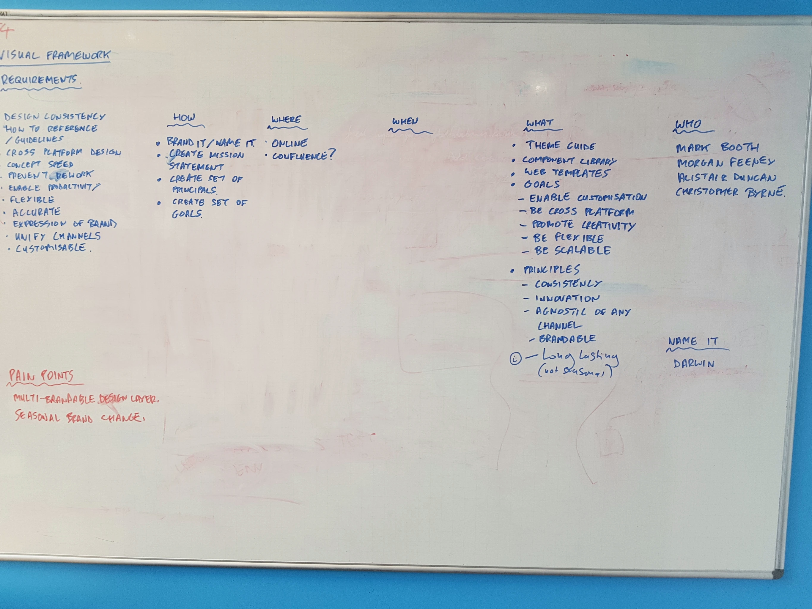
At that point I wanted to align our core values so we could work together more effectively.
It had to be:
- Consistent
- Platform agnostic
- An enabler of productivity
- Customizable
- Scalable
One of the things that emerged from this workshop was that we needed a name, some way of referring to the design system.
Fortunately the name “Darwin” didn’t last long. Chris came up with a more contemporary instance of it, “Origin”.
What is a design system?
It was important to make a distinction between a component library and a design system. They are 2 parts of the same whole, however, a component library that has no rules on how it can be used, eventually leads to subjectivity, imposes limitations, and offers no guidance on how to invent new components; resulting in "Franken-components" as what exists gets regurgitated.
This isn’t the fault of the implementer.
People come and go, unless there is documentation, communication and some kind of governance things will eventually degrade, as was the case with previous instances.
After studying what I consider to be true design systems: the likes of Material Design, Grid Systems in Graphic Design, I decided it was ultimately documentation that we needed to produce. Because of this, we could produce an M.V.P. using something like Microsoft Word or Google Docs; this way we wouldn’t need to invest time in writing code until later on in the process. Documentation would be a single source of truth; and it could be translated to any medium.
In order to produce it we had to create some high fidelity designs. There wasn’t any point designing components in isolation, they wouldn’t make sense when combined with other components. Due to this chicken-and-egg situation it made sense to abstract common components that emerged through designing journeys.
In order to do that we would at-least need what we referred to as “building blocks”— sub-atomic elements of the design system—typography, layout, media, colour, elevation, shape, etc.
Producing the building blocks would be enough to get the system off the ground in and start to provide consistency.
Data-driven research
I progressed to research and iterate upon what I would create, and how it could then form part of an overall system. Following Josef Müller-Brockmann’s manual—but applying the principles to web design—I started with Media.
I researched N Brown’s Google Analytics data and created several reports that detailed popular devices and browsers.
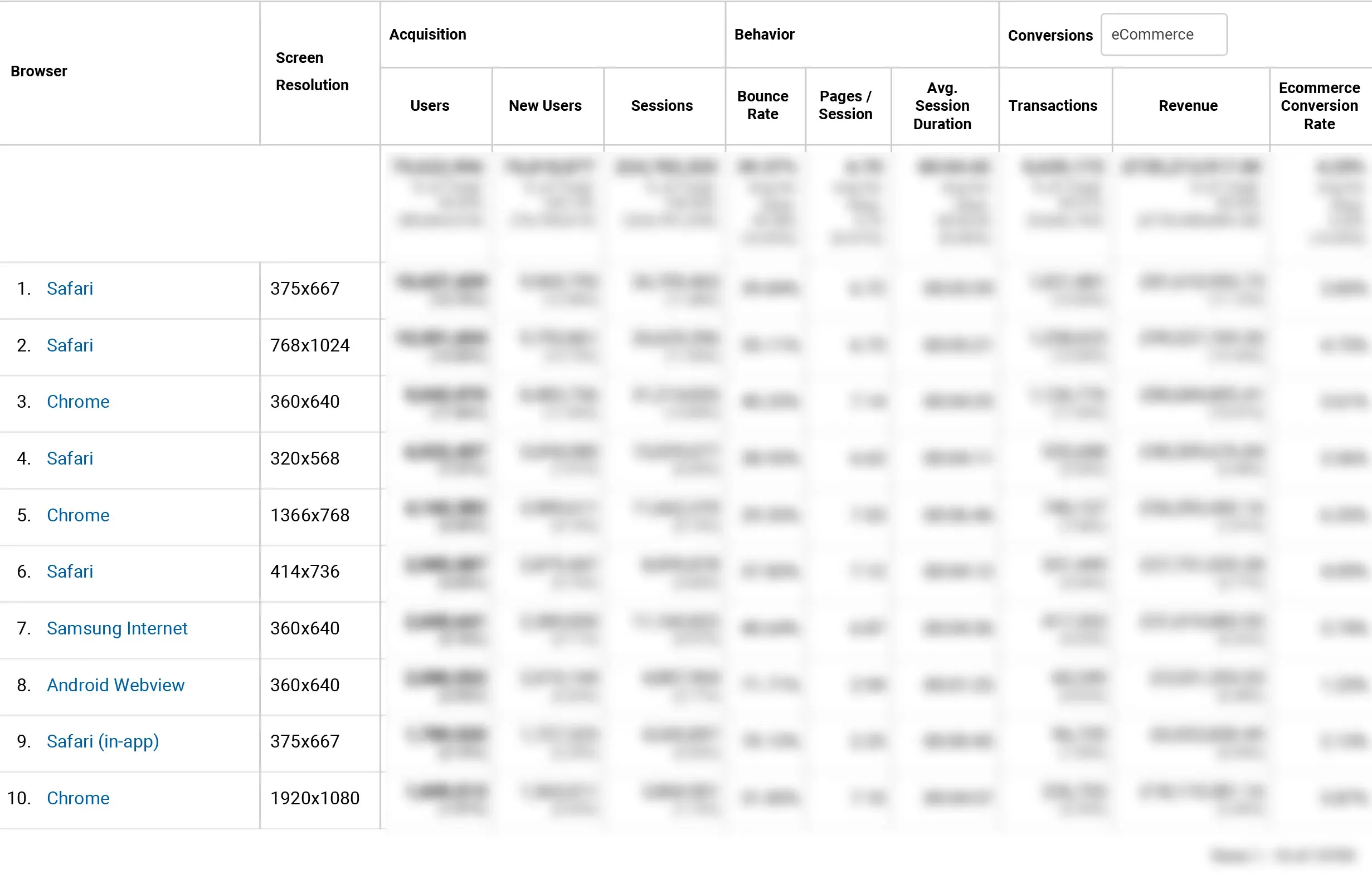
I discovered that mobile usage and sales topped the list (no surprise), while Internet Explorer was pretty much nowhere to be found (always a blessing).
The most popular screen resolutions were aggregated; the information was then used to create Sketch art boards for design purposes, and media breakpoints in CSS. The analytics data was also fed into caniuse.com to determine browser support for features such as CSS Grid and custom properties. This enabled me to decide upon a progressive approach that would cater for browsers that don’t support CSS Grid and custom properties, yet would provide an enhanced, more elegant, solution for those that did.
Based on what I learnt I then created:
- A simple prototype demonstrating how CSS Grid could be used to create flexible layouts
- A range of hi-fidelity designs demonstrating how a modular grid system could potentially be used to arrange text and imagery (Fig. 3-5)

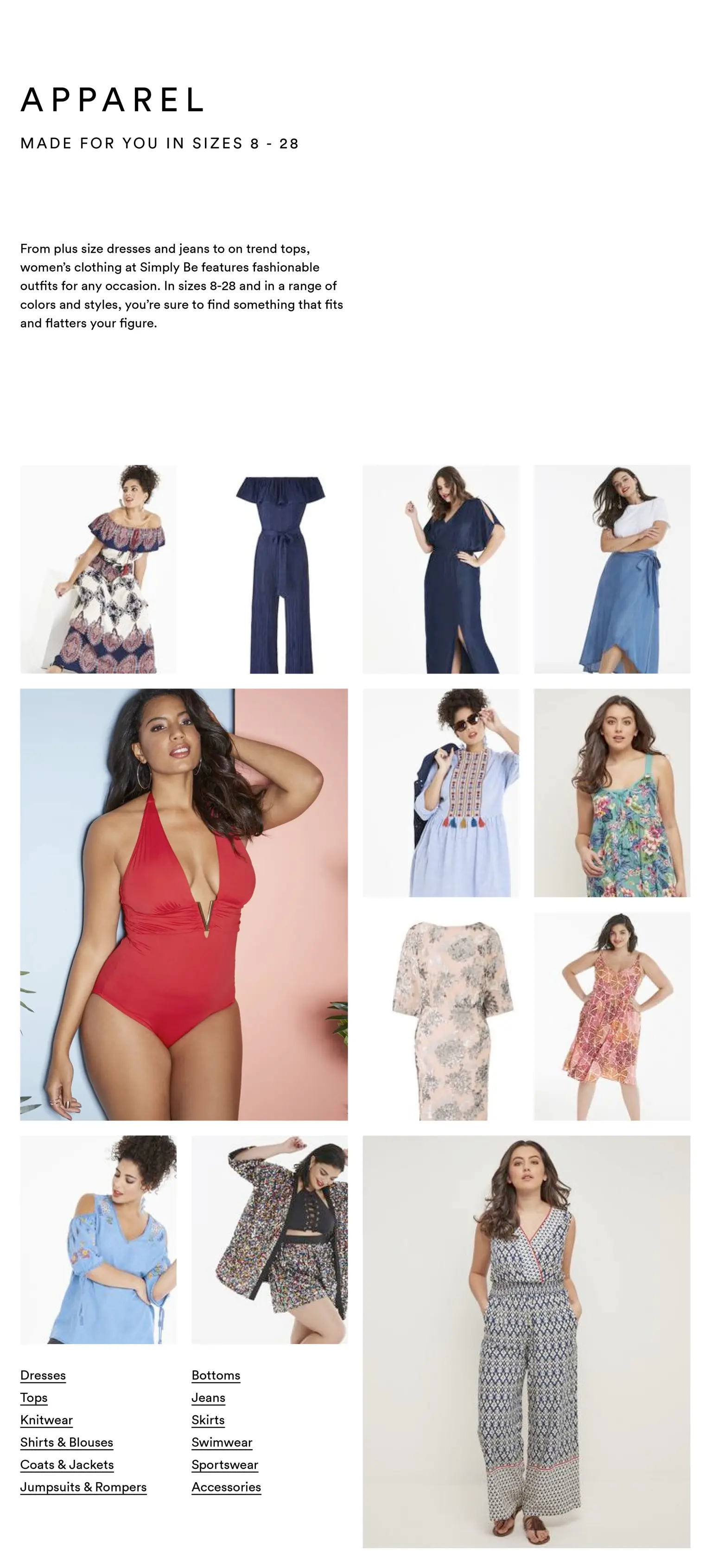
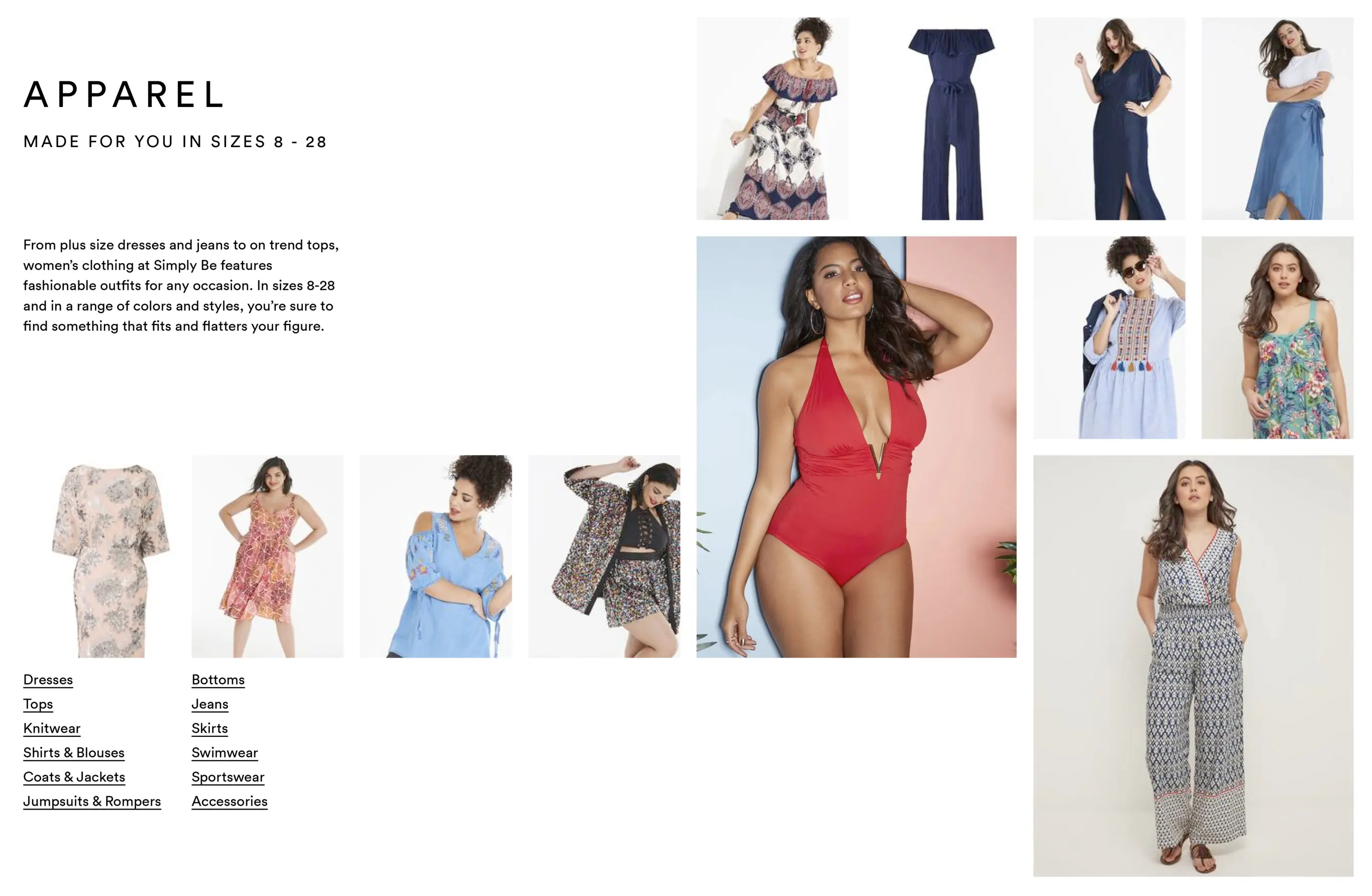
The main thing needed to create designs was content, as traditionally a design system is designed around, and tailored to suit it.
Because N Brown is the parent company of several fashion brands, the majority of content would be fashion photography, product copy and promotional content. I decided Origin should be able to accommodate standard product list style layouts, yet enable more creative editorial style layouts. I wanted to encourage a different kind of thinking towards what could be accomplished.
I presented my concepts to members of the UI team for feedback; which was positive.
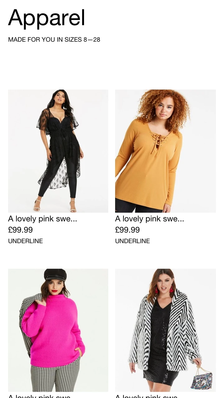
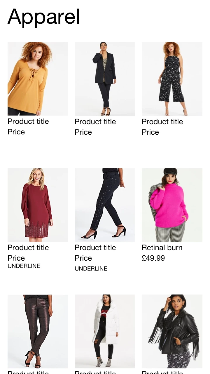
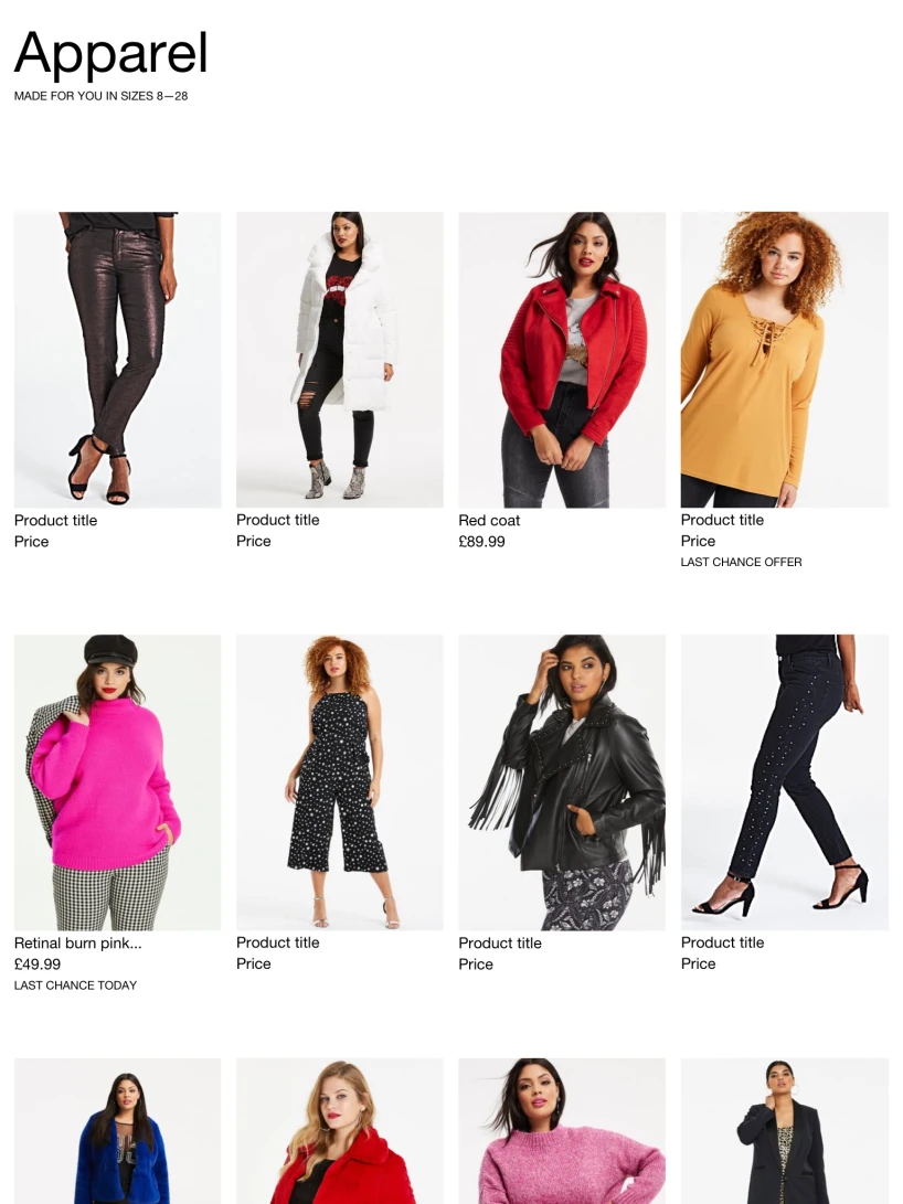
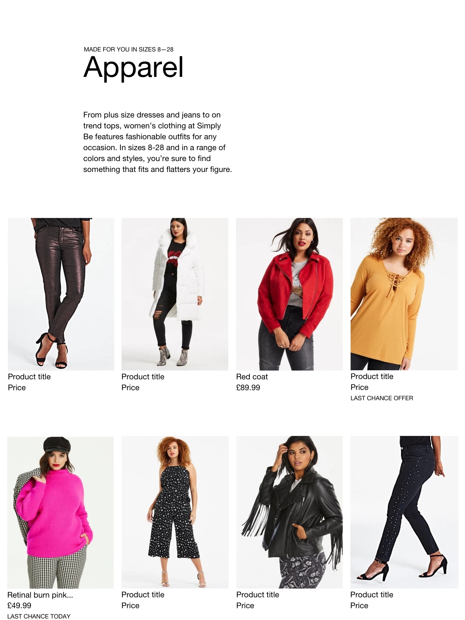
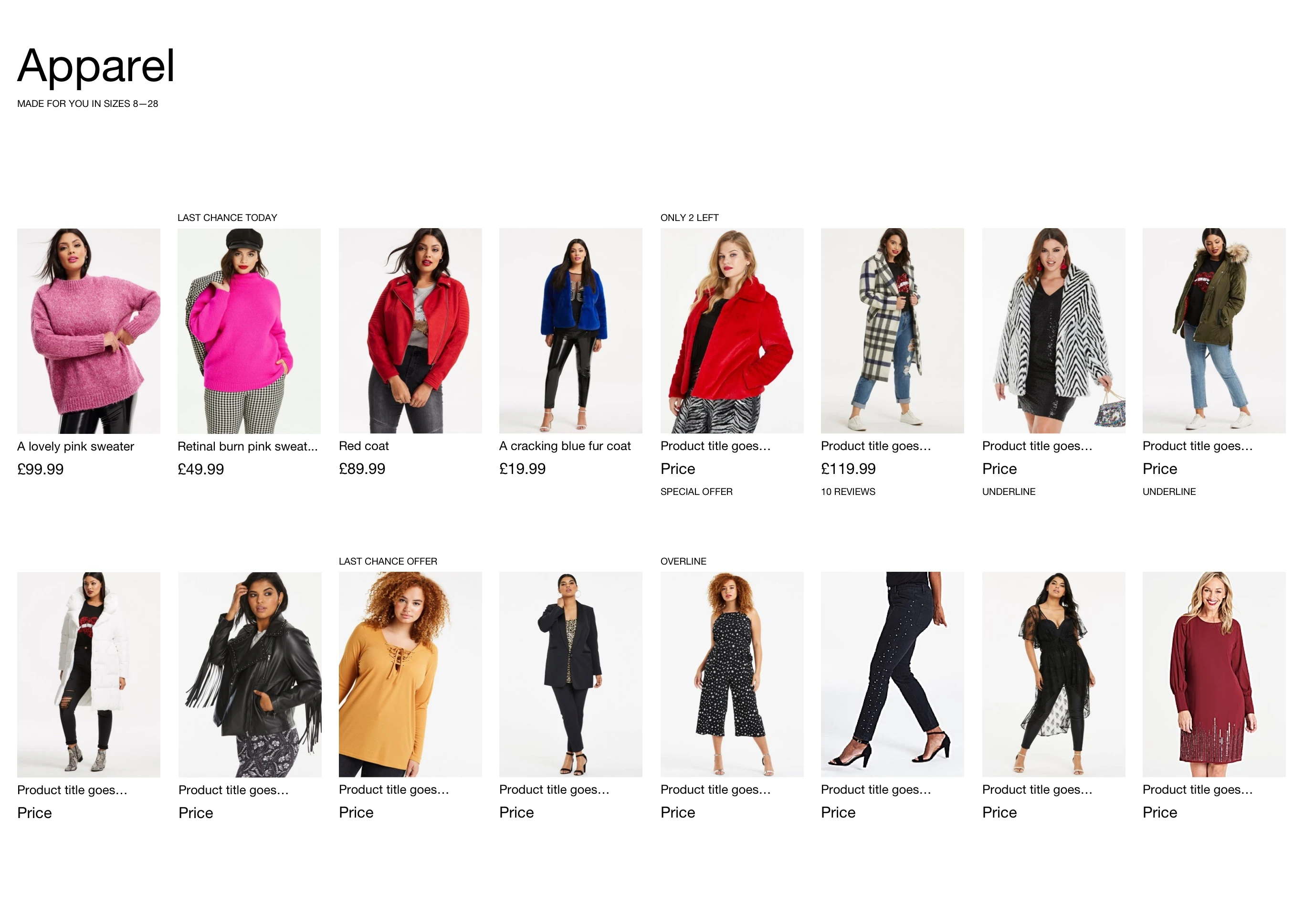
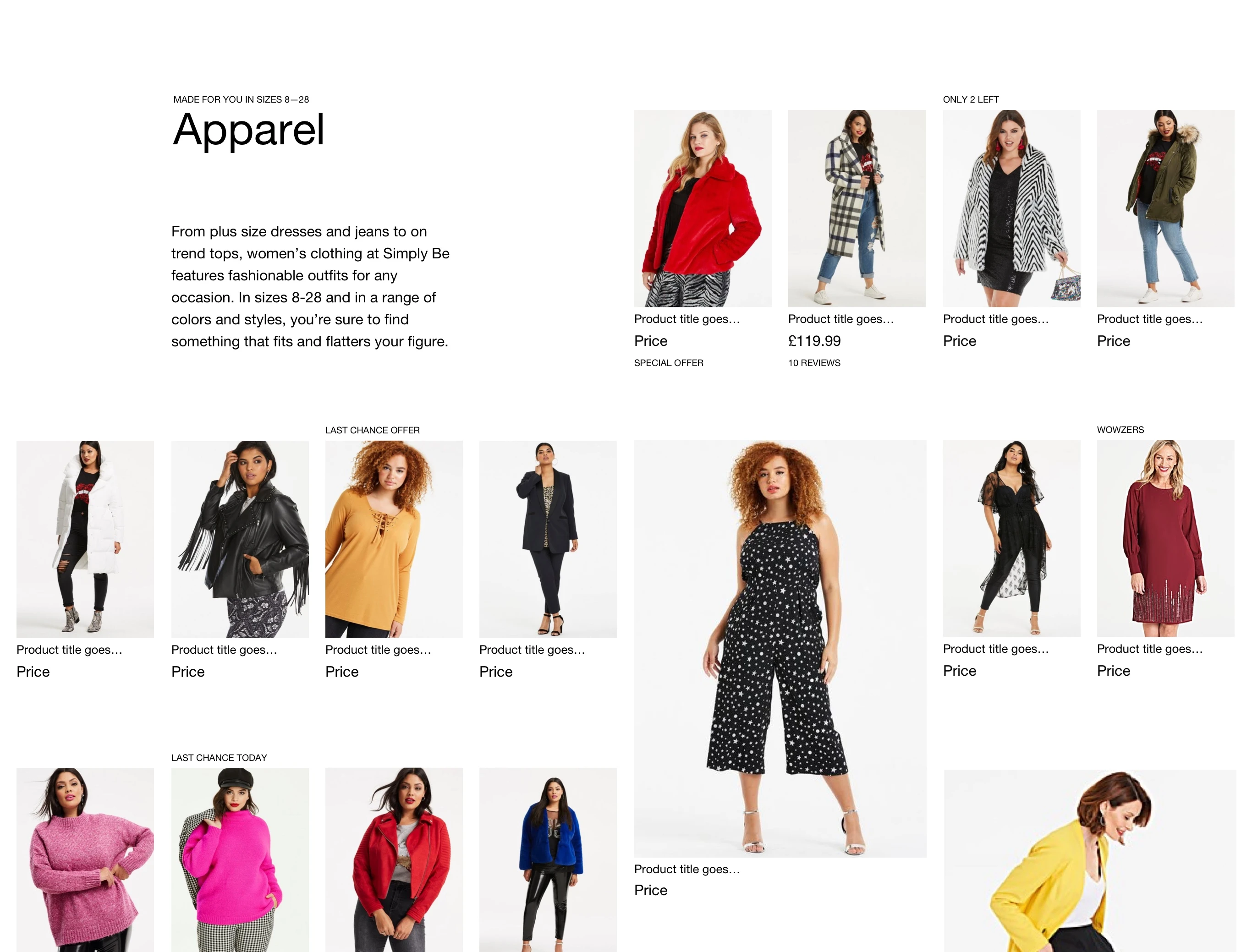
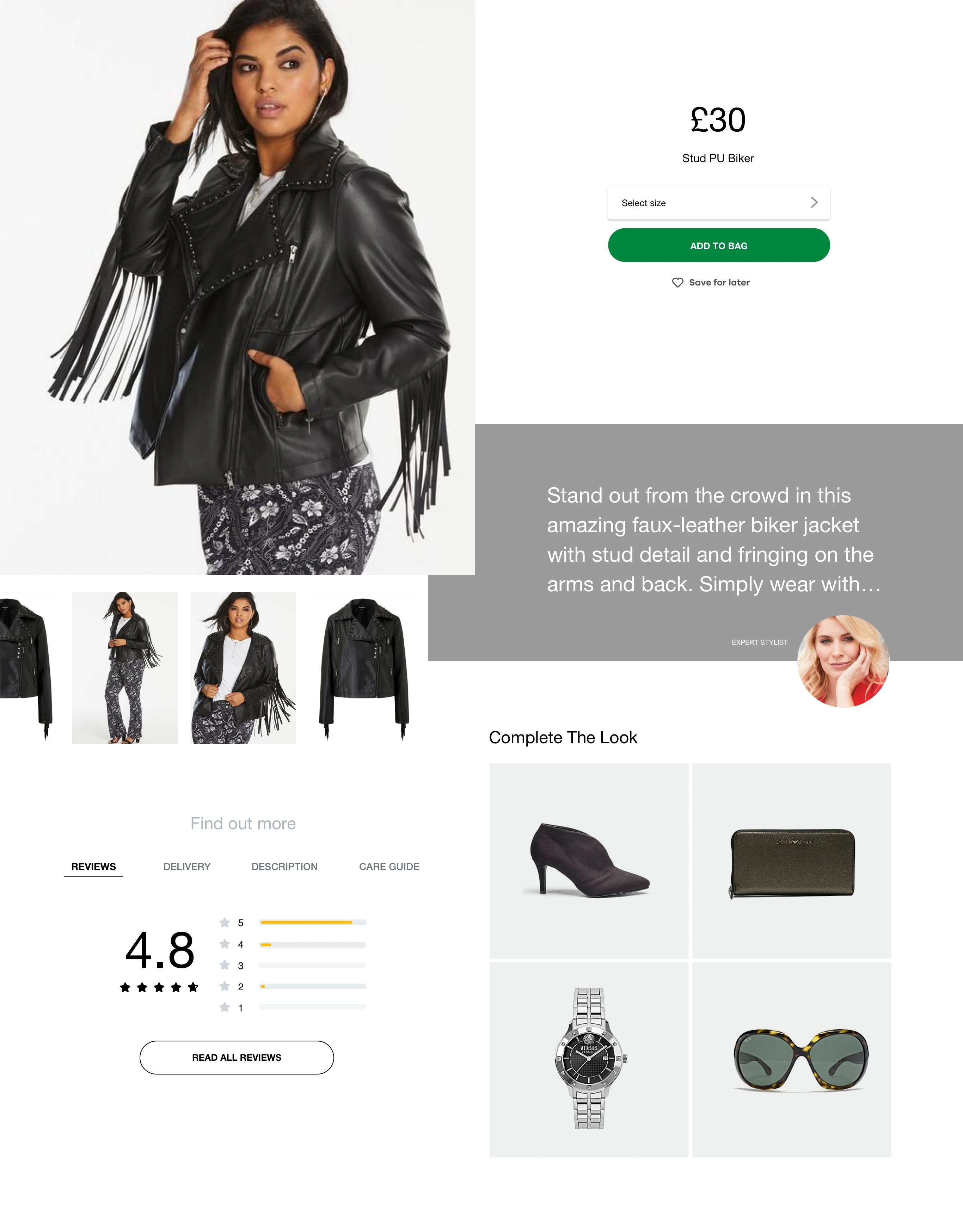
During that period, the importance of understanding how what was designed could eventually be built, was paramount; I iterated between designing and creating prototypes using HTML & CSS, whilst writing the documentation for Typography, Imagery & Grid Systems.
This led to the production of:
- High fidelity product list page layouts designed using the same grid, but with different layouts
- A high fidelity product details page layout using the same grid
- High fidelity designs of data heavy areas such as “shopping bag” and “my account”
- Working prototypes built using CSS Grid and Custom properties
- Documentation on how to use a combination of grids, typography and imagery to achieve the designs I created
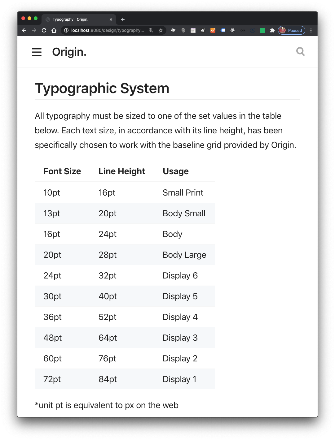
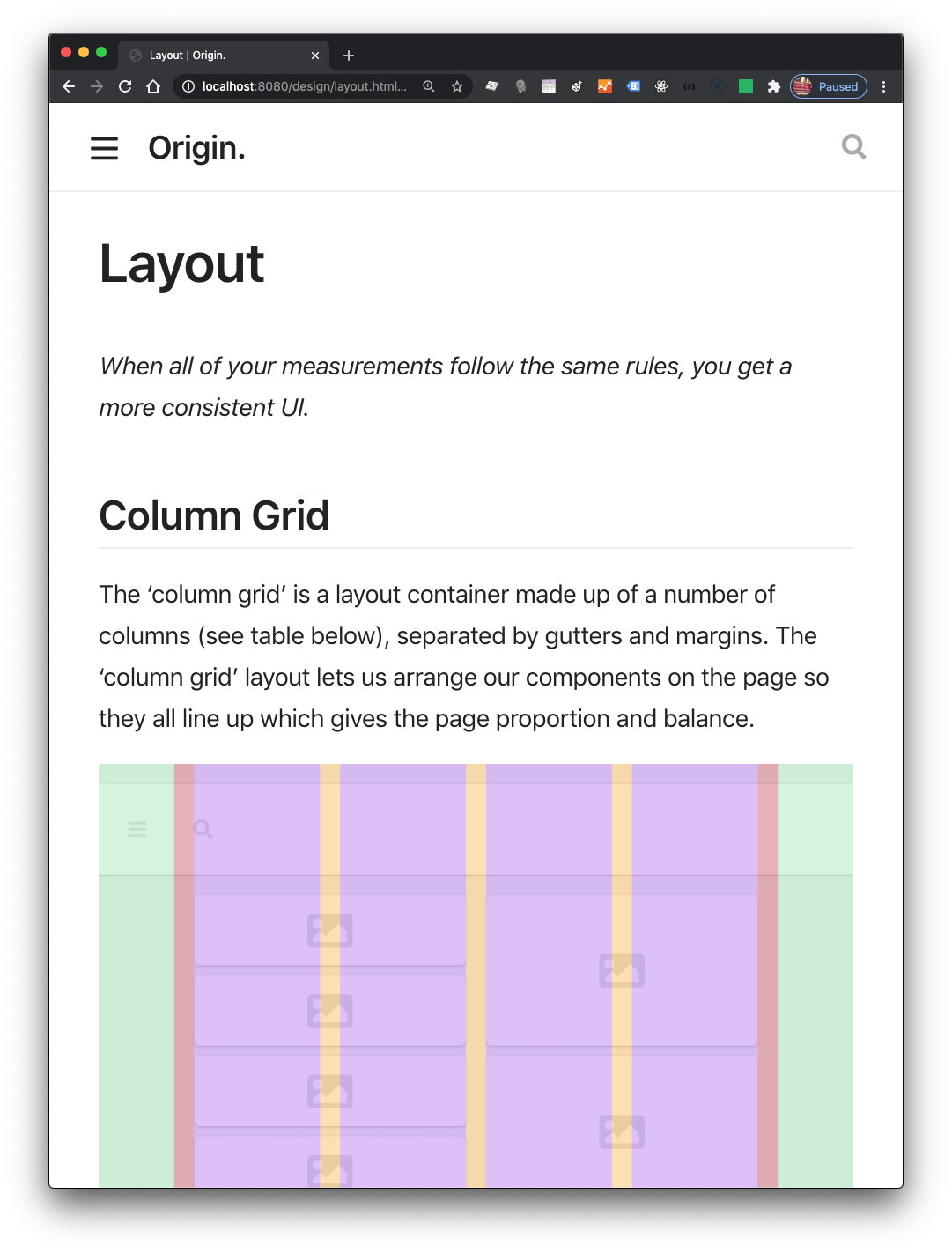
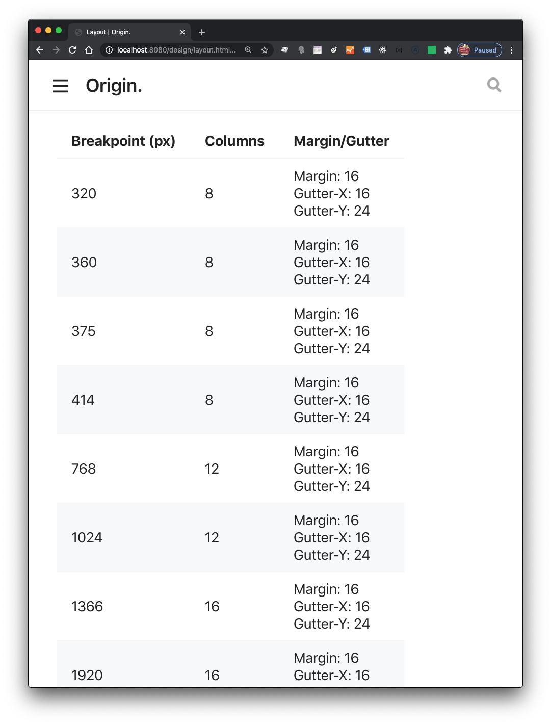
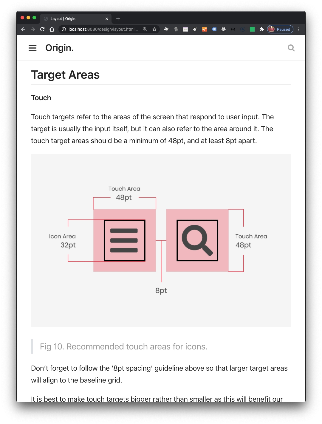
I had evidence that what I had done, worked.
I collaborated with colleagues to add other UI components to see how it all connected, if things didn’t quite work I refined things and iterated until they did.
Getting more buy-in
Winning over stakeholders within an organisation plays a significant part of the success of a design system.
In a nutshell this is how it went: I convinced Mark and the team to buy into the idea, Mark got buy-in with one of the company directors at that time, who became a key-stakeholder in the project. After this point, Origin wasn’t a side-project anymore, which meant we could all officially book time to it.
That director then got buy-in from more directors in other departments, the next thing we knew we had a presentation to prepare for.
The first-half of the presentation demonstrated the existing problems that Origin would solve—we produced component audits and used them to show how things degraded over time and the implications, lack of consistency, repetition, bugs, silos, and mundane design work.
The latter-half focused on demonstrating Origin in action, starting out with demoing the Sketch implementation, and how that would enable designers to focus on what matters and using it to create prototypes, right through to working HTML prototypes, the designs I created were a key part of this.
The feedback was positive; our stakeholders were excited by what was presented, we were encouraged to keep going!
Things began to slow down, a lot
My use of Modular Grids and the emerging editorial look-and-feel challenged the status quo, which unsettled some colleagues. I was able to produce visuals that looked 'nice', and impressed certain stakeholders, but when taken seriously also raised concerns about user experience. Ultimately what we had was a conflict of interests, I was primarily concerned with what I consider the main building blocks, text & imagery, and getting those things correct from the start as they comprise the majority of web content. Whereas, others were very focused on interactive user interface elements, fitting all this stuff together using modular grids produced more than a few kinks. I therefore had to revise the approach I had taken, and adapt the grid system to be less restrictive.
We had produced the building blocks, a working system comprised of:
- Media sizes
- Typographic system
- Grid system
- Spacing system
- Colour palettes
- Buttons
- Elevation
- Rules on proximity
- Rules on accessibility
- Sketch templates & libraries to design with
- All this was also written in code
But something was stopping us from doing the work necessary to get things off the ground. There was far too much discussion about the system and not enough use—it wasn’t moving fast enough, this meant things almost ground to halt, more and more people were being involved that required bringing up to speed—the level of procrastination was palpable.
Due to business priorities changing Origin began a hiatus.
Things changed
The break didn't last for long, everyone involved with Origin was committed to the cause.
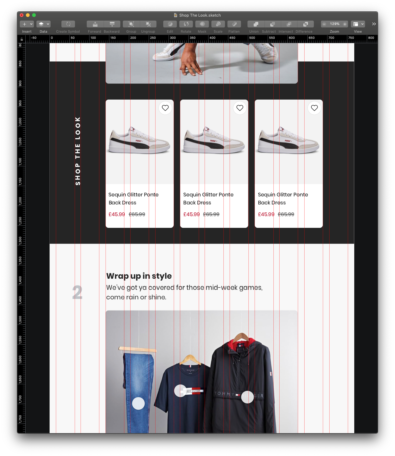
Fortunately, Chris decided to develop the system further whilst designing user interfaces used on the Jacamo & SimplyBe apps. This enabled the system to be iterated upon, and was a thorough test drive with real-world examples Fig. 17-18. For me this was the moment I was waiting for, seeing another designer deciding to fully adopt the system and get the kind of results I knew were possible.
Somehow we managed to get past a stage of rejection, and what may have been a painful experience for several designers, to a new one, where adoption was occurring organically.
I had long done my part by this stage, Origin began a life of its own.

What’s next for Origin?
Origin has successfully been adopted, and re-branded to NBUX, the UX team have put their stamp on it and taken ownership, moving the system forward. It has taken a massive amount of effort, and involved many people, NBUX will evolve further with each of N Brown's brands.
Big thanks to Chris Byrne for being awesome and allowing me to include some of his work Fig. 17-18.
Written by Morgan Feeney
I’ve been designing and developing for almost 2 decades.
Read about me, and my work.
For juicy tips and exclusive content, subscribe to my FREE newsletter.
