Advanced Responsive Grids with Tailwind

Introduction
If you want to learn how to use Tailwind's CSS Grid utilities and arbitrary classes to level up and create real-world layouts, look no further. By real-world, what I mean is actual content that flows, text & images, the core of the internet, not coloured boxes.
Tailwind's grid system
Tailwind deconstructs a very popular 12 column grid system into a series of utility classes that are categorised by the various properties of the CSS Grid spec, here's a small excerpt:
/* grid-template-columns */
grid-cols-1: grid-template-columns: repeat(1, minmax(0, 1fr));
...
grid-cols-12: grid-template-columns: repeat(12, minmax(0, 1fr));

/* grid-column-start/end */
col-span-1: grid-column: span 1 / span 1;
...
col-span-12: grid-column: span 12 / span 12;
col-start-1: grid-column-start: 1;
...
col-end-2: grid-column-end: 2;

/* grid-row-start/end */
row-span-1: grid-row: span 1 / span 1;
...
row-span-12: grid-row: span 12 / span 12;
row-start-1: grid-row-start: 1;
...
row-end-1: grid-row-end: 1;
row-end-2: grid-row-end: 2;Responsive layout container
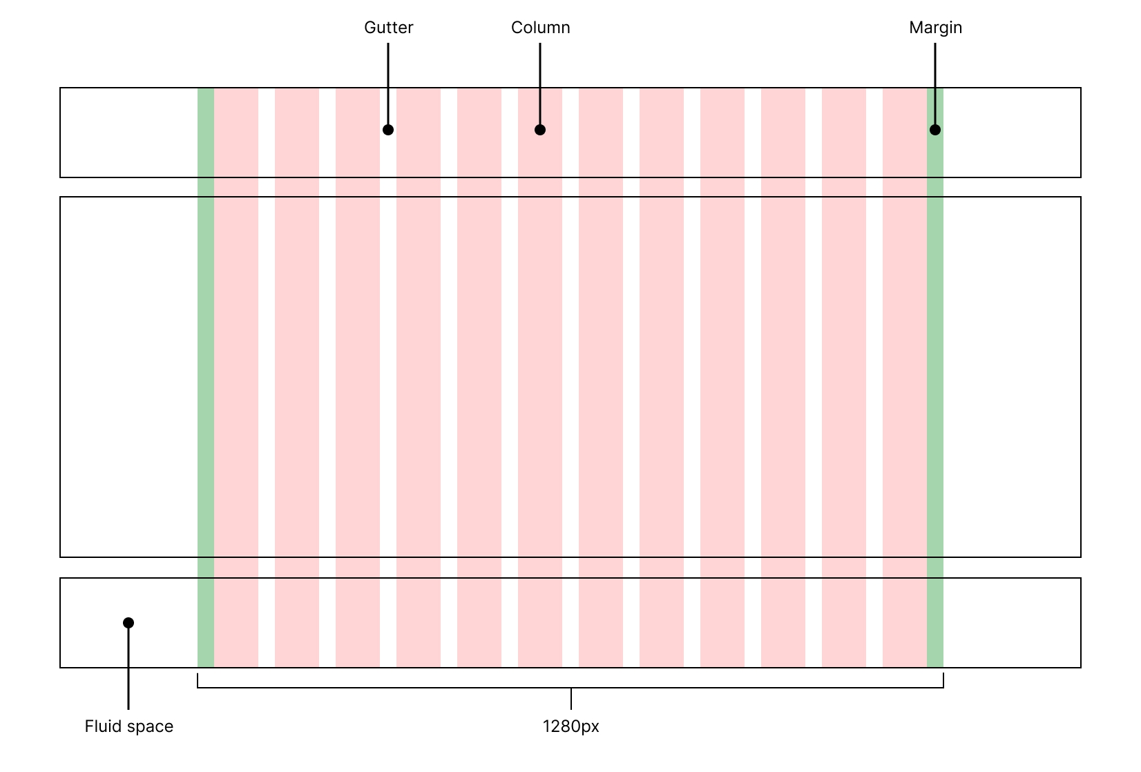
In this exercise there are 2 parts of the overall system, one that constrains the layout in a container (this one) and the content itself, which is placed in the container:

I’ll refer to the header, main, and footer as regions.
The width of the container is 1280px which is the 2nd largest breakpoint that comes with Tailwind, below 1280px it’s 100% of the viewport width.
There are margins either side, so the content is inset, the total width of the container also comprises the margins.
Building a responsive layout container with Tailwind
There’s more than 1 way this can be done with Tailwind, I prefer using arbitrary values, but will demonstrate 2 ways this can be done way for the sake of comparison:
<article class="grid gap-y-6 text-white">
  <div class="bg-zinc-700">
    <div class="max-w-7xl m-auto">
      <header class="grid gap-x-4 px-6">
        <h1>header</h1>
      </header>
    </div>
  </div>
  <div class="bg-zinc-700">
    <div class="max-w-7xl m-auto">
      <main class="grid gap-x-4 px-6">
        <h2>Main</h2>
      </main>
    </div>
  </div>
  <div class="bg-zinc-700">
    <div class="max-w-7xl m-auto">
      <footer class="grid gap-x-4 px-6">
        <h2>Footer</h2>
      </footer>
    </div>
  </div>
</article><article class="grid gap-y-6 text-white">
<div class="grid grid-cols-[1fr_minmax(0px,1280px)_1fr] bg-zinc-800 gap-x-6">
<header class="grid col-start-2">
<h1>header</h1>
</header>
</div>
<main class="grid grid-cols-[1fr_minmax(0px,1280px)_1fr] bg-zinc-800 gap-x-6">
<section class="grid col-start-2">
<h2>Main</h2>
</section>
</main>
<footer
class="grid grid-cols-[1fr_minmax(0px,1280px)_1fr] bg-zinc-800 gap-x-6"
>
<section class="grid col-start-2">
<h2>Footer</h2>
</section>
</footer>
</article>What’s common in both is that the layout container can be applied to each region of content, a header, a main and a footer. This system allows the flexibility to add background colours to the fluid space within regions and also the container.
In both examples the width of the container is constrained at a maximum width of 1280px.
If, like me, you want to make use of grid-gap to add space between the different regions the 1st example requires more elements, without them grid will force the container to be the intrinsic width of it's content, not 1280px. That is why, in my opinion, it’s also an out-of-date date way of doing things, therefore I prefer the 2nd example.
Content within the container
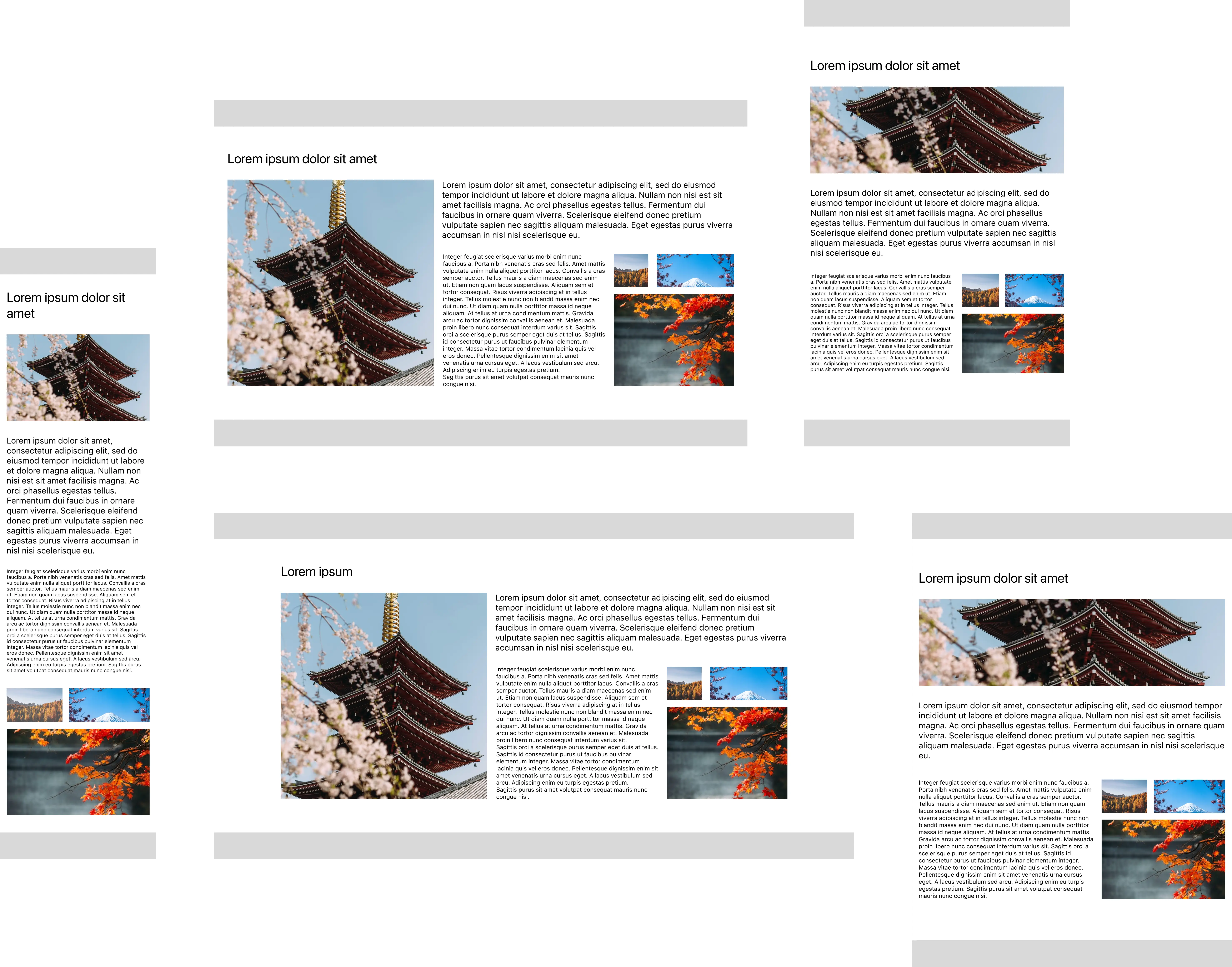
My layout is based on a mid-point (tablet) and then adjusted for mobile and larger screens. The design allows the content to be laid out without changing it too much at each breakpoint, that kind of decision can save on repetitive work, i.e. too many things changing at each breakpoint.
The content can be categorised as such:
- Title
- Hero image
- Intro text
- Paragraph
- Image grid
You can see the different layouts across breakpoints will be like so:


Building a responsive layout on a 12-column grid with Tailwind
Now we have somewhere to place the content, let’s add it. The HTML created in the previous step will house the content. You might notice I added a header and footer that are grey, they exist to demonstrate where a header and footer might go, I won’t be utilising them in this exercise.
For context take a look at this codepen which is a fully working example, and then I'll walk you through how each element relates to another.
Or if you just want to look at code, here it is:
<article class="grid gap-6">
  <header class="wireframe bg-gray-200 h-[3rem]"></header>
  <main class="grid grid-cols-[1fr_minmax(0px,1280px)_1fr] gap-6 gap-y-8">
    <section
      class="grid grid-cols-12 col-start-2 gap-4 lg:gap-6 gap-y-8 content-start"
    >
      <h1 class="col-span-12 text-4xl mt-12">Lorem ipsum dolor sit amet</h1>
      <img
        class="col-span-12 h-[13rem] lg:h-[31rem] w-full object-cover lg:col-span-5 lg:row-span-2"
        src="https://images.unsplash.com/photo-1522850959516-58f958dde2c1"
        alt="red and brown tower at daytime"
      />
      <p class="text-xl col-span-12 lg:col-span-7">...</p>
      <p class="text-xs xl:text-sm col-span-12 sm:col-span-7 lg:col-span-4">
        ...
      </p>
      <figure
        class="grid grid-cols-12 col-span-12 sm:grid-cols-5 sm:col-span-5 lg:col-span-3 gap-4 content-start"
      >
        <img
          class="col-span-5 sm:col-span-2 h-[5rem] w-full object-cover"
          src="https://images.unsplash.com/photo-1508255139162-e1f7b7288ab7"
          alt="brown trees"
        />
        <img
          class="col-span-7 sm:col-span-3 h-[5rem] w-full object-cover"
          src="https://images.unsplash.com/photo-1490806843957-31f4c9a91c65"
          alt="Mt. Fuji, Japan"
        />
        <img
          class="col-span-12 sm:col-span-5 h-[12.9375rem] lg:h-[14.8125rem] w-full object-cover"
          src="https://images.unsplash.com/photo-1572929128258-41e525a382e5"
          alt="trees during autumn"
        />
      </figure>
    </section>
  </main>
  <footer class="wireframe bg-gray-200 h-[3rem]"></footer>
</article>Let’s start with the <main/> attraction as that’s where the content will be added, I don’t want to interfere with the container so, to keep them separate I add a <section/> element:
<section
  class="grid grid-cols-12 col-start-2 gap-4 lg:gap-6 gap-y-8 content-start"
></section>I’ll explain what’s going on with the section; because the layout container is a grid consisting of 3 columns, I must specify where I want to place my container, I do this with: col-start-2, grid will by default span 1 column, so I now have placed the container where I want it to be, in the second column, remember there are 3: 1fr_minmax(0px,1280px)_1fr.
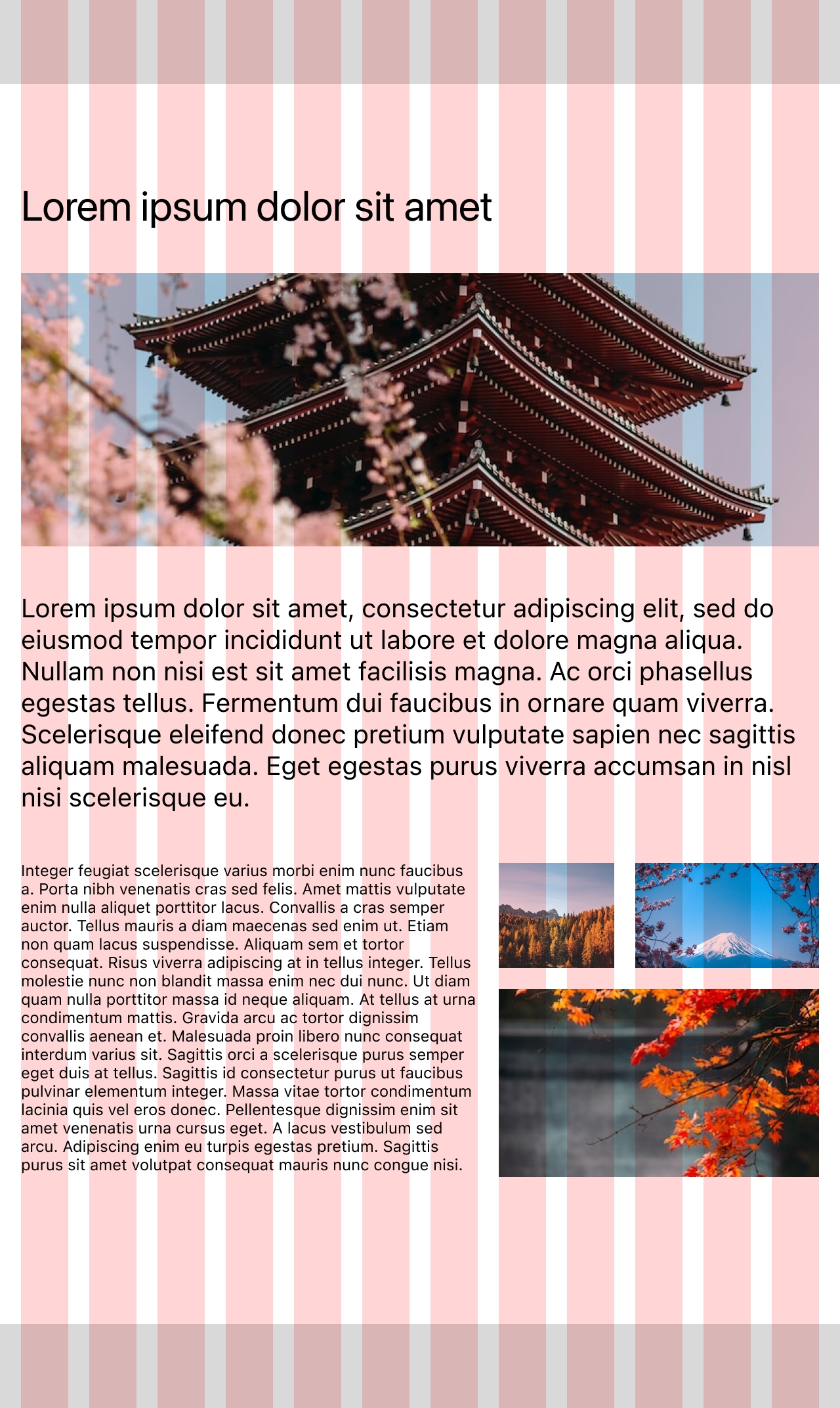
I apply a 12-column grid with grid grid-cols-12, gaps, and specify that content should be placed at the start. Now we’re ready to go through each element within the section one by one:
Title
By using col-span-12 the title spans... you guessed it, all 12 columns.
It’s good practice to not let lines of text run on forever-and-ever as they are harder to read, so I might have considered capping the width of the title by applying lg:col-span-8 on larger screens as it will fill the full width of the container, but as it’s a short title I won’t.
Hero image
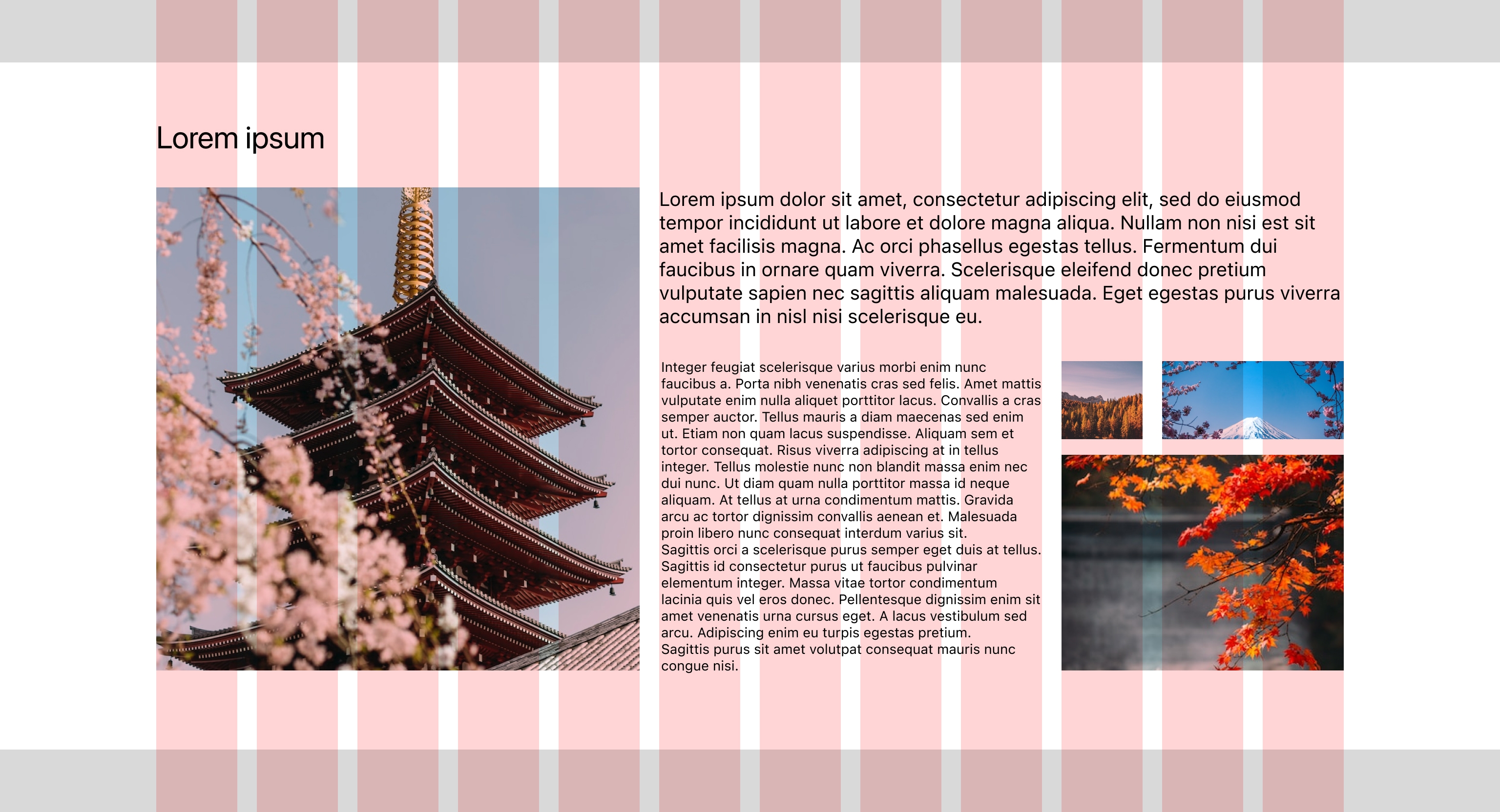
The main image spans 12 columns until the lg breakpoint (1024px) where its orientation changes to portrait, and it spans 5 columns, I’ve also given it a height and applied object-fit.
I would normally combine this treatment with a <picture/> element, however as this post about layout I’ll skip that.
This is super important, I used the change of orientation to control the placement of other content, I’ll explain in more detail. Grid is smart, it knows that unless I specify explicitly how many columns to span, to just go ahead and fill the remaining space with content.
So, because I only specified how many columns to span and not where to span from, the simple calculation of 5 + 7 = 12 and having 12 columns available means that grid takes over and does the layout for me.
There’s one more thing, I specified that I want the image to span all the available rows, without that the layout would look like a Picasso, try removing lg:row-span-2, and see for yourself.
Intro text
The font-size won’t change across breakpoints, it spans 12 columns until the lg breakpoint (1024px) where it then spans 7 columns.
Paragraph
It has 3 breakpoints due to being adjacent to the image grid, the font-size changes once.
Image Grid
I used a <figure/> element for this as using <div/> for everything is boring, live a little, try all the elements.
Image Grid retains its layout across breakpoints, corresponds to its parent grid on what is essentially a sub-grid (but it doesn’t use the sub-grid spec as support is not good) dig into the code and you’ll see what I mean. Image Grid starts out like the rest of the content, it has the same number of columns applied at this point (12) and the content within is also laid out on a 12 column grid so it corresponds to everything else, then, at the sm breakpoint (640px) it spans 5 columns and likewise the number of columns applied to it is 5, so the content corresponds to... you get the picture.
If things don’t align properly what’s the point? We have the tools.
At the lg breakpoint (1024px) Image Grid spans 3 columns, and if we go off what I said about things lining up you would be right in thinking that we’ll be changing the columns to match, but nope, I just broke my own rule. It doesn’t make sense to do that here due to the parent’s grid gaps being bigger than I want for this, and the layout would look weird, so at this point the 5-column grid works so I keep it. There’s no point following a rule when it doesn’t make sense to do so.
Conclusion
Tailwind makes using CSS Grid for simple, repeatable, layouts easy and familiar. I’ve used it with several projects and the more I used it, the more I got used to the system, but let’s face it you could say that about most frameworks.
Feel free to reach out to me on Twitter, bye for now!
FAQ
Does it always make sense to use CSS Grid?
I'm a huge fan of CSS Grid, I always favour it for any kind of layout, the main reasons for this are:
- CSS Grid is 2 dimensional, which means unlike flex items, grid items can be placed both horizontally and vertically (x & y).
- With
display: gridthe amount of boilerplate HTML needed to create a layout is usually always less than it would be with display: flex. - The
grid-gapproperty has been supported for longer, grid-gap was revolutionary, gaps were a huge problem in the world of CSS grid systems, you can see how obsessed over them, I was by looking at this codepen collection of mine. - Using
display: gridhas become second nature to me, pretty much anything that can be done with flex can be done with grid and more!
When doesn’t it make sense to use CSS Grid?
There are times when I’ve had to ask myself "why am I writing more code than I would otherwise need with flex?". These are the times when I have to let CSS Grid down gently—as it’s making life more complicated—and use flex. Paradoxically, with Tailwind this is not an issue due to it being utility based, maybe Tailwind is a gateway to more CSS Grid uptake.
Does it make sense to wrap content in markup for layouts like this?
Yes, but it depends, I've found with complex layouts grouping regions and sub-regions helps me keep my sanity and a sense of being organised, but go with what works. For the purposes of this demonstration adding more markup would have made it less useful.
If you have any suggestions as to how the examples can be made clearer, easier to understand, or how I can add any missing use-cases you feel would help others, I'd love nothing more than to hear from you! Reach out to me on Twitter, or shoot me an email.
Written by Morgan Feeney
I’ve been designing and developing for almost 2 decades.
Read about me, and my work.
For juicy tips and exclusive content, subscribe to my FREE newsletter.
