How to use the Tailwind CSS Grid System

Introduction
In this piece, we're going to explore the process of using Tailwind's utility-based Grid system to create responsive grid layouts.
For those unfamiliar, Tailwind is a utility-first CSS framework that accelerates the process of building web interfaces, it's well-known for being a productivity booster. Tailwind deconstructs a classic 12 column Grid into an assortment of predefined CSS utility classes that you can mix, match, and customize to bring your design vision to life.
This guide is suitable for any level of developer that knows how to setup a Tailwind project, if you're new to Tailwind, check out the official documentation to get started.
Outcome of this Guide
By the end of this guide you'll have a responsive layout featuring a header, main, aside and footer (Holy Grail style) built with Tailwind's Grid system, the principles that we cover can be applied to more types of layouts.
Step 1: initial HTML
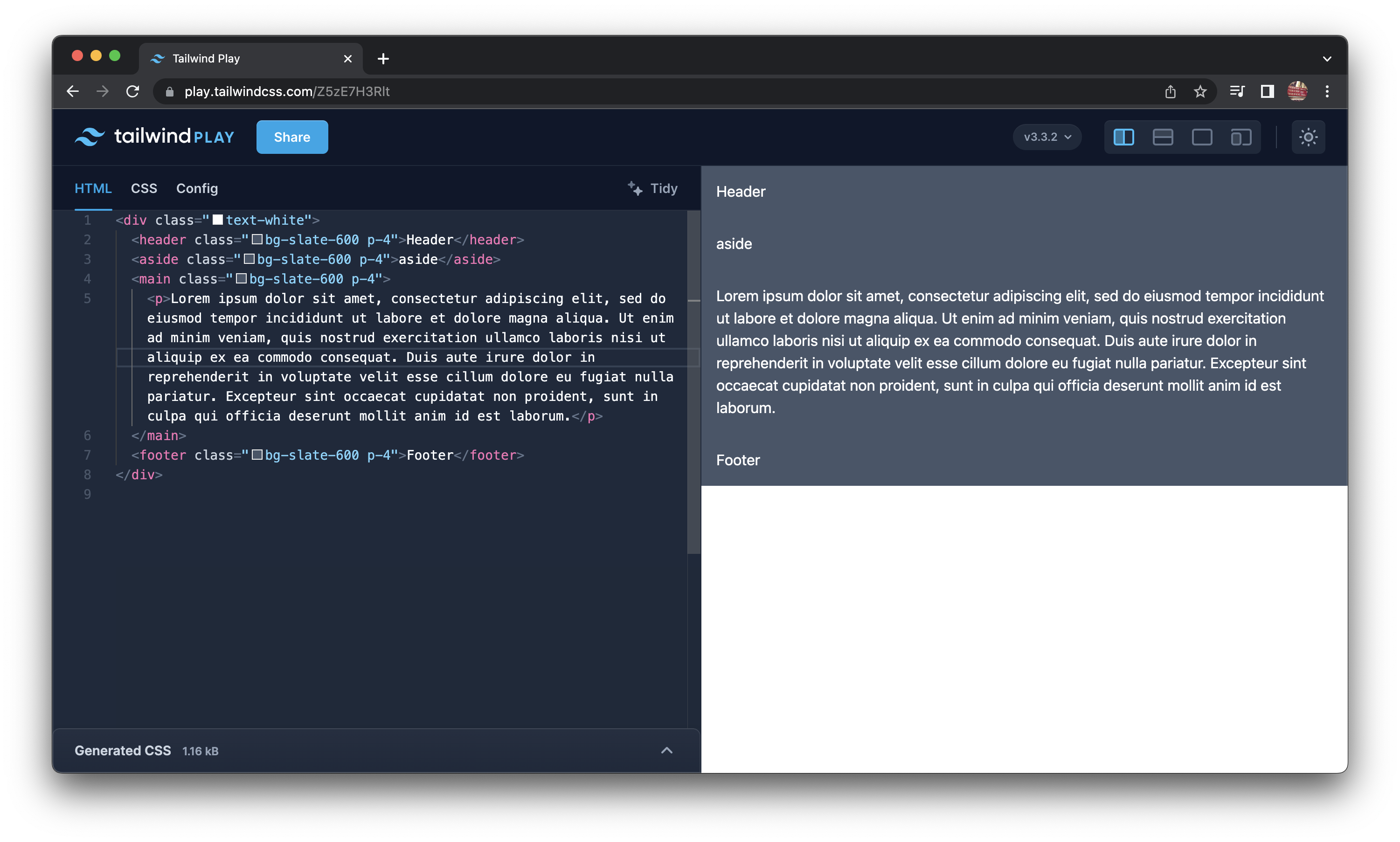
Start with the following HTML skeleton, we'll be adding Tailwind classes to this markup to build our layout.
<div class="text-white">
  <header class="bg-slate-600 p-4">Header</header>
  <aside class="bg-slate-600 p-4">aside</aside>
  <main class="bg-slate-600 p-4">
    <p>Lorem ipsum dolor sit amet, consectetur adipiscing elit, sed do eiusmod tempor incididunt ut labore et dolore magna aliqua. Ut enim ad minim veniam, quis nostrud exercitation ullamco laboris nisi ut aliquip ex ea commodo consequat. Duis aute irure dolor in reprehenderit in voluptate velit esse cillum dolore eu fugiat nulla pariatur. Excepteur sint occaecat cupidatat non proident, sunt in culpa qui officia deserunt mollit anim id est laborum.</p>
  </main>
  <footer class="bg-slate-600 p-4">Footer</footer>
</div>
Note that I used the following semantic elements: header, main, aside, and footer.
Semantic HTML elements are not required, but they are recommended for accessibility purposes.
To aid the visualisation of the layout, I've added placeholder text within the main element, and a dash of color with Tailwind's utility classes (use any colours you like).
Step 2: Add the Grid Container
In order to use Tailwind's Grid system, we need to add 2 classes, the first is: grid, to apply a set number of columns you need explicitly add them using grid-cols-{n} class.
Let's also apply a gap between the rows and columns.
<div class="grid grid-cols-12 gap-1">If you take a look you'll see a distorted looking layout, this is because we haven't specified how many columns each element should span. CSS Grid implicitly allocates content into the available columns if you don't specify how many columns elements span.
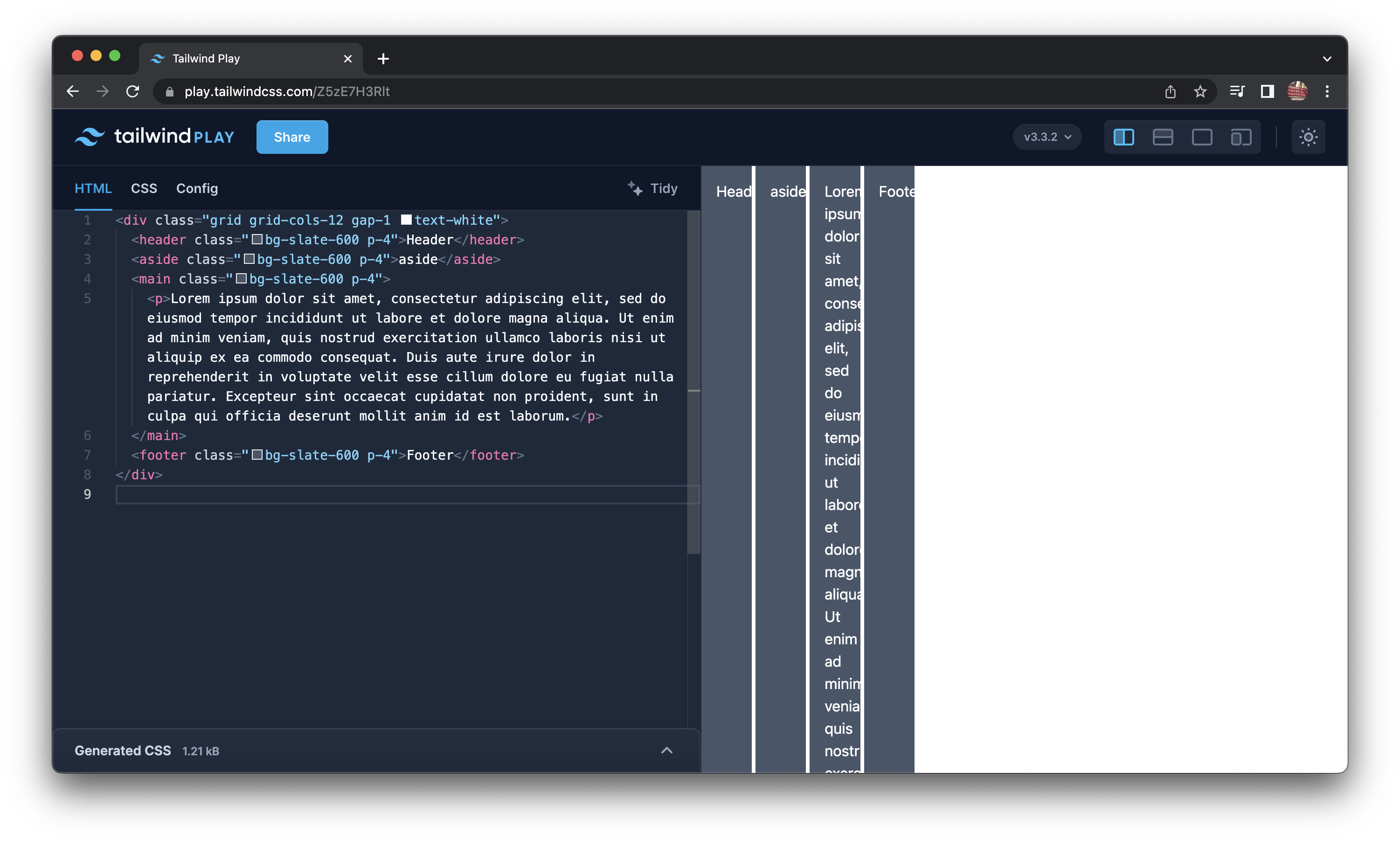
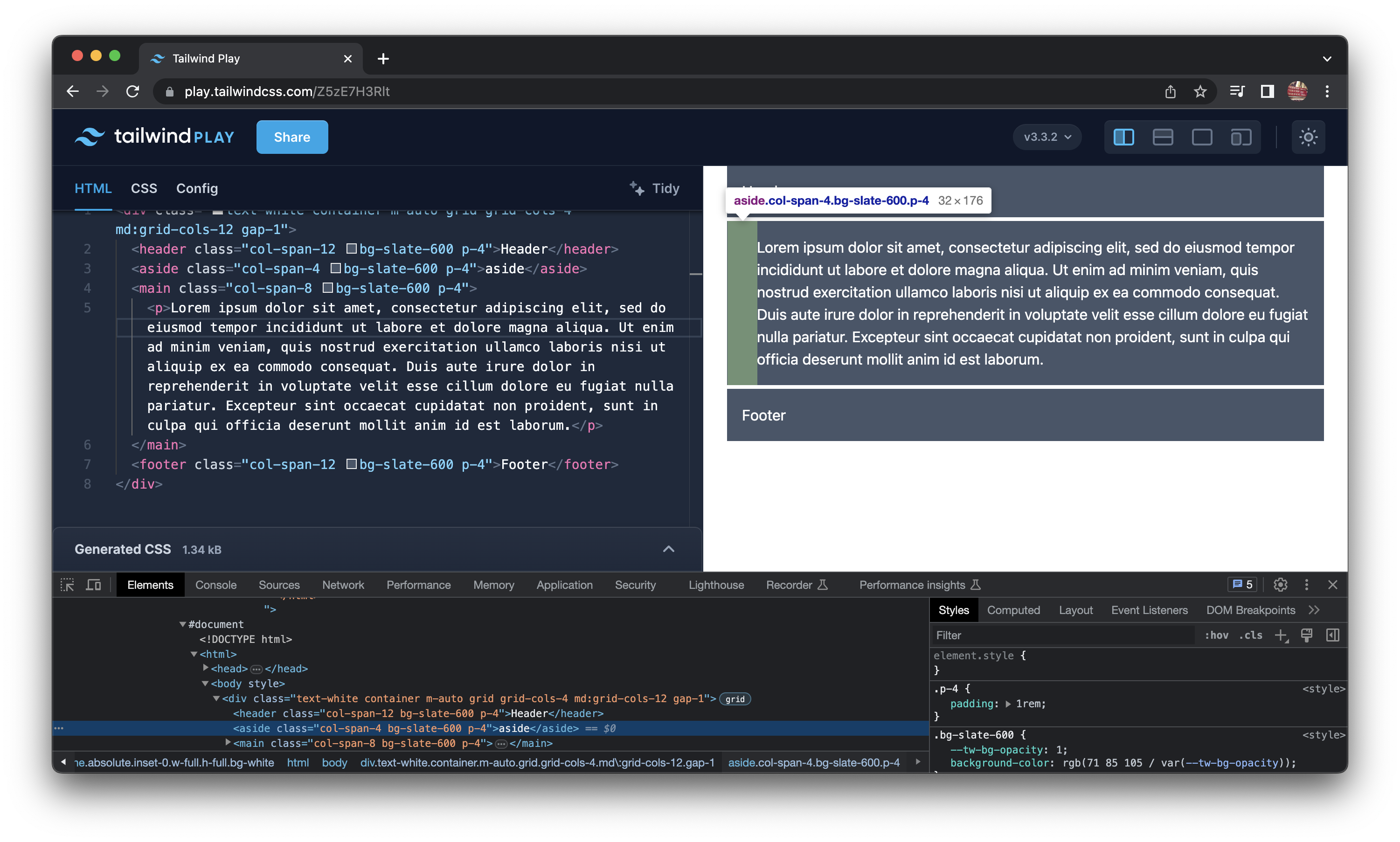
Step 3: Spanning Columns
To span columns, we use the col-span-{n} class, where {n} is the number of columns to span. This is where you'll see the layout finally appear.
<div class="text-white container m-auto grid grid-cols-12 gap-1">
  <header class="col-span-12 bg-slate-600 p-4">Header</header>
  <aside class="col-span-4 bg-slate-600 p-4">aside</aside>
  <main class="col-span-8 bg-slate-600 p-4">
    <p>Lorem ipsum dolor sit amet, consectetur adipiscing elit, sed do eiusmod tempor incididunt ut labore et dolore magna aliqua. Ut enim ad minim veniam, quis nostrud exercitation ullamco laboris nisi ut aliquip ex ea commodo consequat. Duis aute irure dolor in reprehenderit in voluptate velit esse cillum dolore eu fugiat nulla pariatur. Excepteur sint occaecat cupidatat non proident, sunt in culpa qui officia deserunt mollit anim id est laborum.</p>
  </main>
  <footer class="col-span-12 bg-slate-600 p-4">Footer</footer>
</div>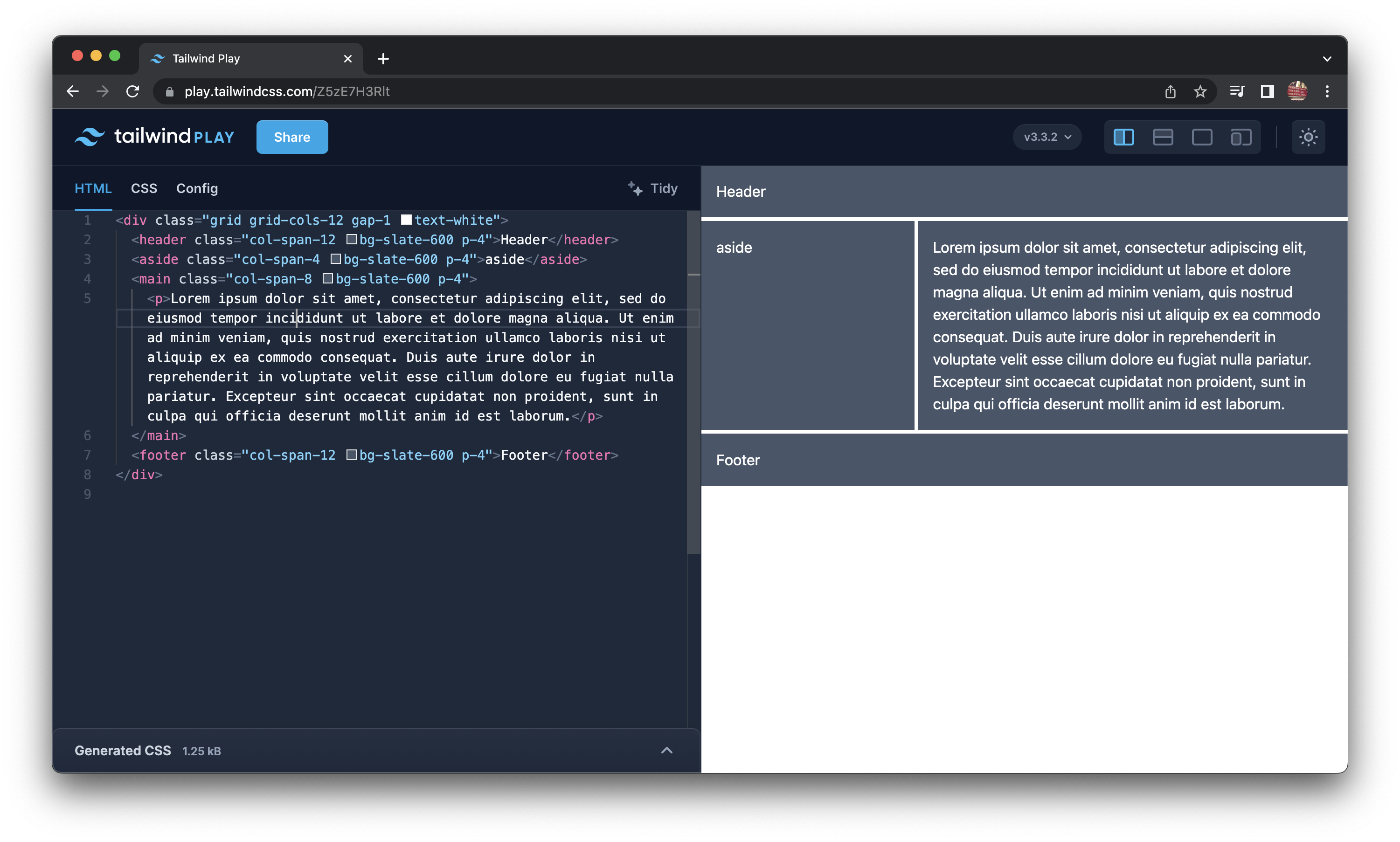
Step 4: Centralising the layout
Let's also centralize the grid by applying 2 more classes.
The container class adds a max-width to the grid, and the m-auto class adds margin: auto to center it.
<div class="container m-auto grid grid-cols-12">
Step 5: Making the layout responsive
We have the layout, but it's not responsive, let's change how the grid behaves on small screens, we'll use the md:grid-cols-{n} class to specify the number of columns to use on screens that are medium or larger.
<div class="text-white container m-auto grid grid-cols-4 md:grid-cols-12 gap-1">This change messes up the layout, but we'll fix that in a minute.
In step 2 we added the col-span-12 class to the header and footer elements, but now there are only 12 columns above a viewport width of 768px, how do we deal with that?
There are a number of ways, one is by using media specific utility classes such as md:col-span-12.
<div class="text-white container m-auto grid grid-cols-4 md:grid-cols-12 gap-1">
  <header class="col-span-4 md:col-span-12 bg-slate-600 p-4">Header</header>
  <aside class="col-span-4 bg-slate-600 p-4">aside</aside>
  <main class="col-span-4 md:col-span-8 bg-slate-600 p-4">
    <p>Lorem ipsum dolor sit amet, consectetur adipiscing elit, sed do eiusmod tempor incididunt ut labore et dolore magna aliqua. Ut enim ad minim veniam, quis nostrud exercitation ullamco laboris nisi ut aliquip ex ea commodo consequat. Duis aute irure dolor in reprehenderit in voluptate velit esse cillum dolore eu fugiat nulla pariatur. Excepteur sint occaecat cupidatat non proident, sunt in culpa qui officia deserunt mollit anim id est laborum.</p>
  </main>
  <footer class="col-span-4 md:col-span-12 bg-slate-600 p-4">Footer</footer>
</div>
The previous example is a bit verbose so let's use the col-span-full class instead, which spans all columns regardless of breakpoint.
<div class="container m-auto grid grid-cols-4 gap-1 text-white md:grid-cols-12">
  <header class="col-span-full bg-slate-600 p-4">Header</header>
  <aside class="col-span-4 bg-slate-600 p-4">aside</aside>
  <main class="col-span-4 bg-slate-600 p-4 md:col-span-8">
    <p>Lorem ipsum dolor sit amet, consectetur adipiscing elit, sed do eiusmod tempor incididunt ut labore et dolore magna aliqua. Ut enim ad minim veniam, quis nostrud exercitation ullamco laboris nisi ut aliquip ex ea commodo consequat. Duis aute irure dolor in reprehenderit in voluptate velit esse cillum dolore eu fugiat nulla pariatur. Excepteur sint occaecat cupidatat non proident, sunt in culpa qui officia deserunt mollit anim id est laborum.</p>
  </main>
  <footer class="col-span-full bg-slate-600 p-4">Footer</footer>
</div>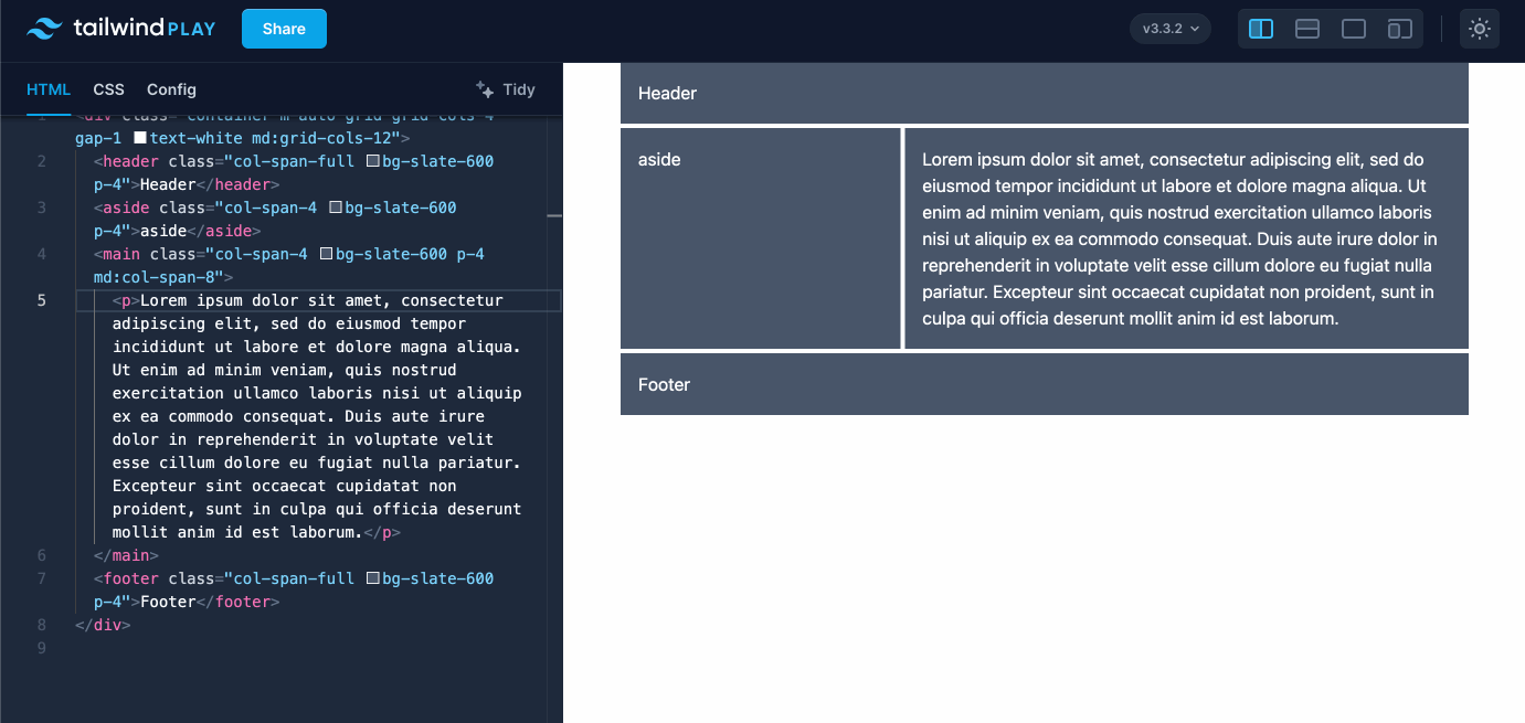
And there we have it, a fully responsive layout built with Tailwind's Grid System, here's a working example on Tailwind Play.
Bonus: Nested grids
Add a nested grid element that can be used for mapping over an array of data, useful for things like product cards.
<div class="container m-auto grid grid-cols-4 gap-1 text-white md:grid-cols-12">
  <header class="col-span-full bg-slate-600 p-4">Header</header>
  <aside class="col-span-4 bg-slate-600 p-4">aside</aside>
  <main class="col-span-4 bg-slate-600 p-4 md:col-span-8 grid gap-4">
    <p>Lorem ipsum dolor sit amet, consectetur adipiscing elit, sed do eiusmod tempor incididunt ut labore et dolore magna aliqua. Ut enim ad minim veniam, quis nostrud exercitation ullamco laboris nisi ut aliquip ex ea commodo consequat. Duis aute irure dolor in reprehenderit in voluptate velit esse cillum dolore eu fugiat nulla pariatur. Excepteur sint occaecat cupidatat non proident, sunt in culpa qui officia deserunt mollit anim id est laborum.</p>
    <div class="grid grid-cols-2 sm:grid-cols-4 gap-1">
      <div class="text-center p-4 bg-slate-800">One</div>
      <div class="text-center p-4 bg-slate-800">Two</div>
      <div class="text-center p-4 bg-slate-800">Three</div>
      <div class="text-center p-4 bg-slate-800">Four</div>
      <div class="text-center p-4 bg-slate-800">Five</div>
      <div class="text-center p-4 bg-slate-800">Six</div>
      <div class="text-center p-4 bg-slate-800">Seven</div>
      <div class="text-center p-4 bg-slate-800">Eight</div>
    </div>
  </main>
  <footer class="col-span-full bg-slate-600 p-4">Footer</footer>
</div>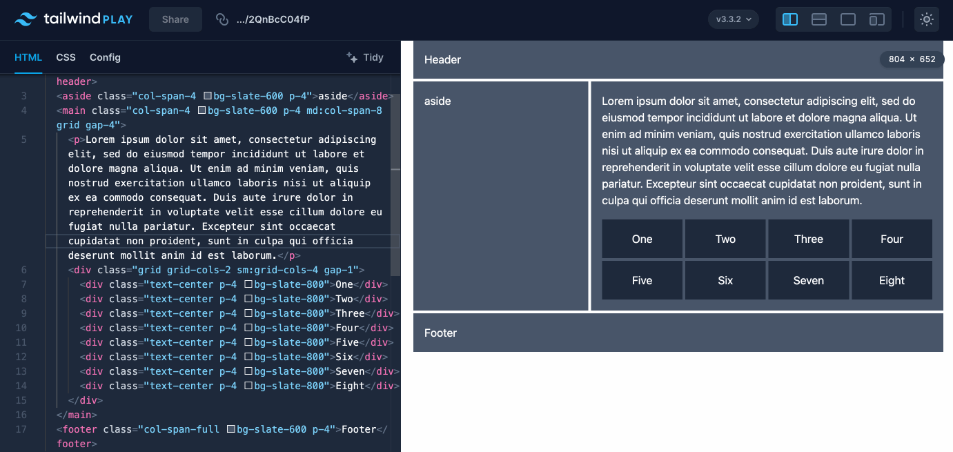
Checkout the working example on Tailwind Play.
If you have any suggestions as to how the examples can be made clearer, easier to understand, or how I can add any missing use-cases you feel would help others, I'd love nothing more than to hear from you! Reach out to me on Twitter, or shoot me an email.
Written by Morgan Feeney
I’ve been designing and developing for almost 2 decades.
Read about me, and my work.
For juicy tips and exclusive content, subscribe to my FREE newsletter.