How to Create your own CSS Grid, Grid System

Introduction
In this guide on creating CSS Grid based Grid Systems from scratch, I'll demonstrate my favourite approach that is nothing like what you get with any of the frameworks, it doesn't require a lot of markup, it's mainly applied through a few CSS classes.
You'll notice I mention 12 columns quite a lot throughout, if 12 doesn't suit, don't be put off, you can apply the same rules to a variety of column quantities.
The Tradition of 12 Column Grid Systems
Grid systems are a fundamental aspect of web design, and come in many forms. In the past, popular frameworks such as 960gs, Skeleton, and Bootstrap provided their own grid systems, revolutionizing web layout. They leveraged the float property or flexbox, plenty of markup, and a hefty dose of margin.
Those frameworks were inspiring and filled a significant void in the field of web layout. I remember the moment I successfully developed my Bootstrap-style grid system using Sass to perform the necessary calculations for a utility-based Grid System. It felt like an accomplishment.
Recently, Material UI and Tailwind have become popular choices, employing CSS Grid under the hood.
Regardless of the underlying CSS paradigms, one thing all these Grid Systems have in common is they typically feature 12 columns, gutters, and margins.
Advantages of 12 Columns
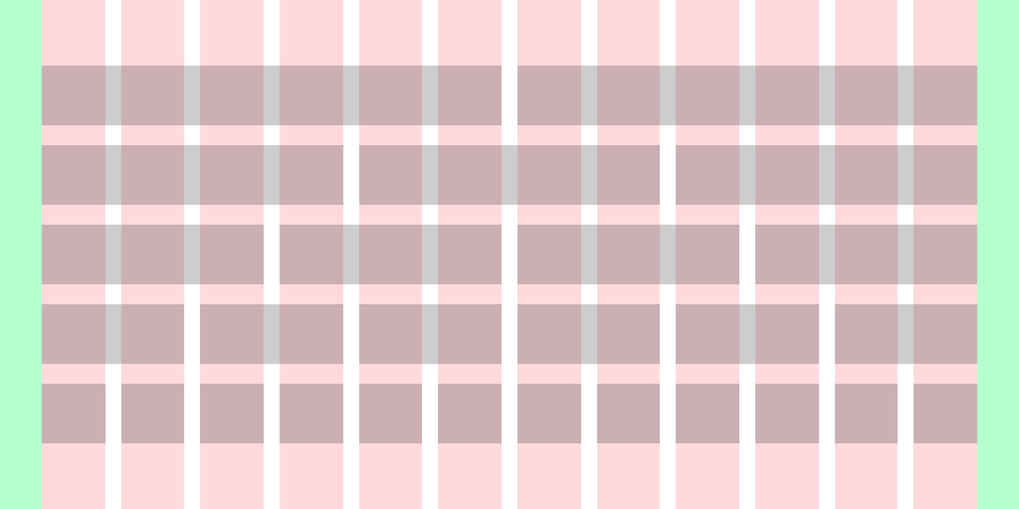
A 12-column grid is easily divisible, and can be divided in various ways: 12 / 2, 12 / 3, 12 / 4, and so on, with further combinations possible.
Despite the ubiquity of 12 columns, it remains a practical approach that suits most website designs. There are rare cases that buck the trend and demand a custom solution, but in my experience people only really care about the practicality of the system over anything else.
To demonstrate the advantages of 12 columns, let's compare with 10 columns:
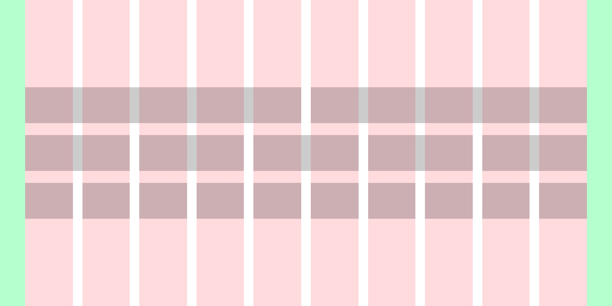
There aren't as many possibilities with a 10 column grid when compared to a 12 column grid. You should always consider practicality when deciding on a the number of columns in your grid, for me, I know I get enough variety from 12 columns so tend to stick with it.
Feel free to experiment, and go with what works for you.
Insights from Graphic Design
In Josef Müller-Brockmann's book, Grid Systems in Graphic Design, a frequently referenced resource in this field, he argues that Grid Systems should be designed to accommodate the specific content they will contain – in essence, be completely bespoke.
After studying Grid Systems in Graphic Design, and applying (or attempting to apply) the principles to real-world web projects, it became clear that redefining Grid Systems for each web project is neither practical nor economically viable for the majority of cases. I'm not talking about websites that are purely text and imagery, I'm talking about absolutely any kind of product, e.g. a web app, website, ecommerce solution, SaaS, absolutely anything.
Columns, Gutters, Margins and Containers
Terminology is important; in order to understand your Grid System, you also need to understand how things are named so they make sense to yourself and—if you work with others—others you communicate with.
When I talk about Columns, Gutters, Margins and Containers it's in the design sense, I'm not referring to CSS properties.
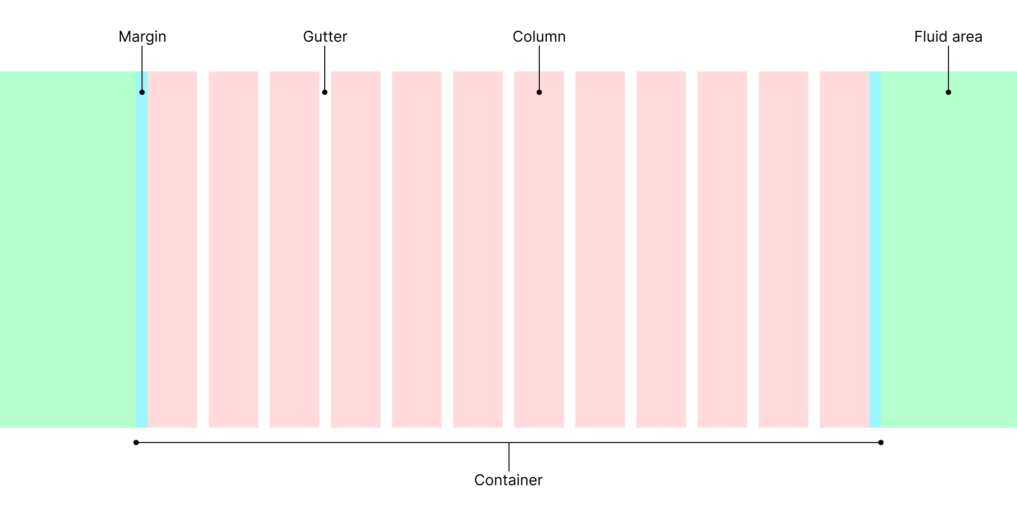
- Columns are are divided from the width of the container
- Gutters are available on both x and y axes, and sit between columns and rows, the illustration above denotes only the vertical columns and gutters which we will be defining explicitly in the next section
- Margins (not to be confused with the
marginproperty) are available at the start and the end of the grid, and are used for creating distance between content and the edge of the window, they can also be used to create a full-bleed effect with imagery - Containers encompass all columns, gutters and margins
- Fluid area is the area outside of the container
Fluid 12 column grid
Creating a fluid 12 column grid, with equal columns and gutters, using CSS Grid is as straight forward as:
.grid {
  display: grid;
  grid-template-columns: repeat(12, 1fr);
  column-gap: 1rem;
}If you apply that code to a container you'll have 12 equal columns with gutters, but no margins. To add the margins we have to be creative and add some customisation, and TBH it's a bit of a CSS trick. As there's no margin property specifically for grid we can coax it into adding an extra gap on each side like so:
We can make use of the margin in a number of ways, in the previous example the image is within the margins, spanning all 12 columns, but in the next one we can bleed the image to the edges of the window by utilising them.
Here's an illustration of what's happening:

We can enhance the grid even further by adding named grid lines, otherwise the ergonomics of it are annoying.
Using named grid lines allows us to use implicitly named grid areas, like so:
.heading {
  grid-column: columns;
}

.hero {
  grid-column: margin;
}
Instead of this:
.heading {
  grid-column: 2 / span 12;
}

.hero {
  grid-column: 1 / -1;
}
What if you want absolute control over margins?
For example, a designer/client might ask for a grid that has margins which are 1.5rem (24px), while the gutters are 1rem (16px).
CSS Grid only allows one size for its gaps in each direction, in order to deal with this we have to go further with the customisation.
Centralising and containing the grid
With some significant adjustments to the previous code I can contain the grid in a central position.
The grid will be fluid and will fill 100% of the viewport until the viewport width is 1024px, where it will be central to the viewport.
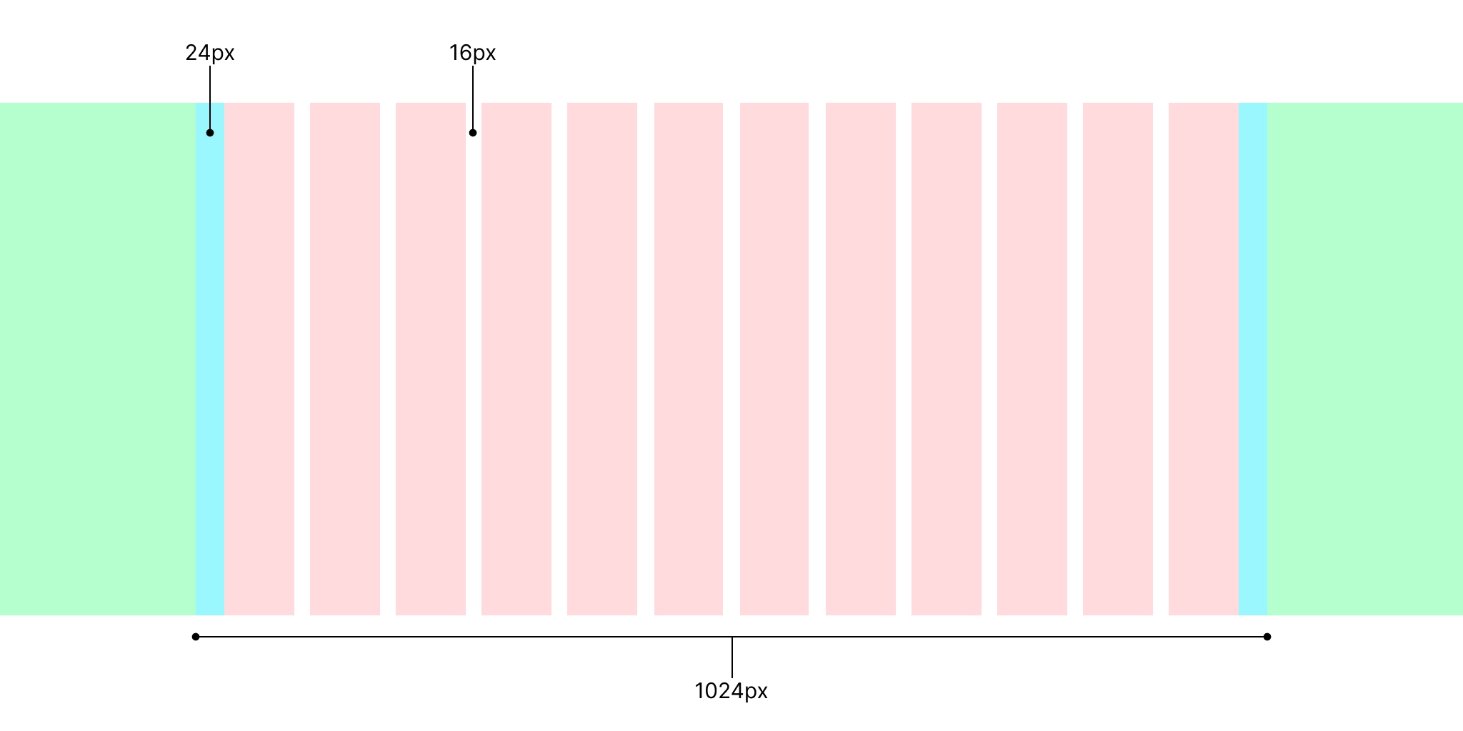
The container is implied by getting the container width (which includes margins), dividing it by 2 and then subtract that amount using calc() and vw units (they are the key here).
:root {
  --container-width: 1024px;
  --fluid-area: calc(50vw - var(--container-width) / 2);
  --margin: 1.5rem;
  --gutter-x: 1rem;
  --column-count: 11;
  --m: var(--margin);
  --g: var(--gutter-x);
  --c: 1fr;
  --container-grid-template: var(--fluid-area) max(
      var(--m),
      env(safe-area-inset-left)
    )
    var(--c) repeat(var(--column-count), var(--g) var(--c)) max(
      var(--m),
      env(safe-area-inset-right)
    ) var(--fluid-area);
  --grid-template-areas: "fm1 m1 c1 g1 c2 g2 c3 g3 c4 g5 c5 g6 c6 g7 c7 g8 c8 g9 c9 g10 c10 g11 c11 g12 c12 m2 fm2";
}

.grid {
  display: grid;
  grid-template-columns: var(--container-grid-template);
  column-gap: var(--gutter-x);
  grid-template-areas: var(--grid-template-areas);
}- I opted for creating the margins, columns and gutters using
grid-template-columnsrather than usinggap, asgaponly comes in one size with a typical 12 column grid system. - I removed named grid lines in favour of
grid-template-areas, I find them easier to manage when the gutters and margins are technically columns, plus you get fine-grained control over every single column, gutter and margin; this is handy for bleeding images or when a designer hands you gives a seemingly impossible layout to build.
Don't let --column-count: 11 throw you, it's 11 as repeat() won't work with 12 in this case as we need the first and last grid columns to be... columns.
:root {
  --container-width: 1024px;
  --fluid-area: calc(50vw - var(--container-width) / 2);
  --margin: 1.5rem;
  --gutter-x: 1rem;
  --column-count: 11;
  --m: var(--margin);
  --g: var(--gutter-x);
  --c: 1fr;
  --container-grid-template:
    var(--fluid-area)
    max(var(--m), env(safe-area-inset-left))
    var(--c) repeat(var(--column-count), var(--g) var(--c))
    max(var(--m), env(safe-area-inset-right))
    var(--fluid-area);
  --grid-template-areas: "fa1 m1 c1 g1 c2 g2 c3 g3 c4 g5 c5 g6 c6 g7 c7 g8 c8 g9 c9 g10 c10 g11 c11 g12 c12 m2 fa2";
}

.grid {
  display: grid;
  grid-template-columns: var(--container-grid-template);
  grid-template-areas: var(--grid-template-areas);
}

.heading {
  grid-column: c1/c12;
}

.hero {
  grid-column: fa1/fa2;
}
I also added a tweak that deals with the notch on iPhone's: max(var(--margin), env(safe-area-inset-left)), max() will always pick the larger of the two values, which on an iPhone will allow the content to not get obscured by the pesky notch.
Change the number of columns across breakpoints
12 columns work well,
but may not always be necessary on smaller screens with less real-estate.
To demonstrate how to make the grid system responsive
I'll set the default column count to 6,
and change it to 12 at a width of 768px.
:root {
  --container-width: 1024px;
  --fluid-area: calc(50vw - var(--container-width) / 2);
  --margin: 1.5rem;
  --gutter-x: 1rem;
  --column-count: 5;
  --m: var(--margin);
  --g: var(--gutter-x);
  --c: 1fr;
  --container-grid-template: var(--fluid-area) max(
      var(--m),
      env(safe-area-inset-left)
    )
    var(--c) repeat(var(--column-count), var(--g) var(--c)) max(
      var(--m),
      env(safe-area-inset-right)
    ) var(--fluid-area);
  --grid-template-areas: "fm1 m1 c1 g1 c2 g2 c3 g3 c4 g5 c5 g6 c6 m2 fm2";
}

.grid {
  display: grid;
  grid-template-columns: var(--container-grid-template);
  grid-template-areas: var(--grid-template-areas);
}

@media (min-width: 768px) {
  :root {
    --column-count: 11;
    --grid-template-areas: "fm1 m1 c1 g1 c2 g2 c3 g3 c4 g5 c5 g6 c6 g7 c7 g8 c8 g9 c9 g10 c10 g11 c11 g12 c12 m2 fm2";
  }
}:root { --container-width: 1024px; --fluid-area: calc(50vw - var(--container-width) / 2); --margin: 1.5rem; --gutter-x: 1rem; --column-count: 5; --m: var(--margin); --g: var(--gutter-x); --c: 1fr; --container-grid-template: var(--fluid-area) max(var(--m), env(safe-area-inset-left)) var(--c) repeat(var(--column-count), var(--g) var(--c)) max(var(--m), env(safe-area-inset-right)) var(--fluid-area); --grid-template-areas: "fa1 m1 c1 g1 c2 g2 c3 g3 c4 g5 c5 g6 c6 m2 fa2"; } .grid { display: grid; grid-template-columns: var(--container-grid-template); grid-template-areas: var(--grid-template-areas); } @media (min-width: 768px) { :root { --column-count: 11; --grid-template-areas: "fa1 m1 c1 g1 c2 g2 c3 g3 c4 g5 c5 g6 c6 g7 c7 g8 c8 g9 c9 g10 c10 g11 c11 g12 c12 m2 fa2"; } } .heading { grid-column: m1-end/m2-start; } .hero { grid-column: fa1/fa2; }
It's an extremely practical solution, one of the nicest elements is that when you declare:
.heading {
  grid-column: m1-end/m2-start;
}

.hero {
  grid-column: fa1/fa2;
}
and then change the number of columns using a media query like so:
@media (min-width: 768px) {
  :root {
    --column-count: 11;
    --grid-template-areas: "fa1 m1 c1 g1 c2 g2 c3 g3 c4 g5 c5 g6 c6 g7 c7 g8 c8 g9 c9 g10 c10 g11 c11 g12 c12 m2 fa2";
  }
}
you don't need to use a media query to change the properties used to span columns, the grid area names are very useful.
Conclusion
It's important to understand the fundamentals of grid systems, where they come from, and the use-cases for them. CSS Grid is powerful; it's the perfect solution for creating a grid system from scratch.
The solutions in this post are extensible, and hopefully you'll be able to take them and add to them in your own way. For instance, with the final result, I can keep building on it adding more containers and breakpoints as needed, without having to faff around too much with the code I have already written.
If you have any suggestions as to how the examples can be made clearer, easier to understand, or how I can add any missing use-cases you feel would help others, I'd love nothing more than to hear from you! Reach out to me on Twitter, or shoot me an email.
Written by Morgan Feeney
I’ve been designing and developing for almost 2 decades.
Read about me, and my work.
For juicy tips and exclusive content, subscribe to my FREE newsletter.