CSS Grid vs. Flexbox
Introduction
Flexbox and CSS Grid are some of the most powerful tools for creating layouts for web content, but which one should you use?
In this guide, we’ll explore the differences between the two layout systems, and learn how to choose the right one for your projects.
As a developer who builds layouts and UI regularly, I often consider whether Flexbox or CSS Grid is the better choice for a particular use-case. Sometimes, the decision comes down to personal preference, while at other times one layout system is uniquely capable of accomplishing the task at hand.
In this guide, I'll showcase working examples where one layout system clearly outshines the other. I'll also highlight fascinating equivalents and interchangeable features achievable with both CSS Grid and Flexbox.
It's important to note a key difference between Flexbox and CSS Grid before we begin. Flexbox is one-dimensional, meaning it can only be used on either the x or y-axis, whereas CSS Grid is two-dimensional, allowing for simultaneous use on both axes.
With that said, let's dive right in!
Flowing boxes
The following layout is only possible with Flexbox, which now conveniently supports gaps along both the x and y axes, it's particularly useful for elements like tags, metadata, and other inline-like content.
.flex-container {
display: flex;
flex-flow: row wrap;
gap: 8px;
padding: 16px;
}

.flex-item {
border: 1px solid;
padding: 8px;
border-radius: 8px;
}
The code in the previous example is remarkably straightforward, and you can see content flowing, like water, filling up any empty space. The closest I could get to that with CSS Grid is shown in the following example, though it's not as simple:
.grid-container {
display: grid;
grid-template-columns: repeat(auto-fit, minmax(200px, 1fr));
gap: 8px;
padding: 16px;
}

.grid-item {
border: 1px solid;
padding: 8px;
border-radius: 8px;
}
To make the boxes wrap into multiple rows, I had to explicitly set a column-width using minmax(200px, 1fr), which enables CSS Grid to fill both rows and columns with content.
However, that's not exactly what we're aiming for, is it? Even though the boxes flow onto new rows they're in uniform columns, so the desired outcome is what transpired in the Flexbox example.
Scrolling overflowing boxes
To take the previous Flexbox example on a tangent, this next one shows how to adapt that code so the boxes overflow their parent container, and become scrollable:
The same thing can also be achieved with CSS Grid:
Due to the content always being on a single line, the results are equal in comparison, this is one of those cases where I really find it hard to choose which way to go. On one hand I think: do what's most obvious, and on the other I think: try something less conventional.
Rows and columns
In contrast to flowing boxes, the goal here is to create uniform columns and rows. Setting up a 3-column grid is a walk in the park with CSS Grid.
.grid-container {
display: grid;
grid-template-columns: 1fr 1fr 1fr;
gap: 8px;
padding: 16px;
}

.grid-item {
border: 1px solid;
padding: 8px;
border-radius: 8px;
}
Because I specified three columns, as there are six <div> elements in the layout there are a total of two rows.
.grid-container {
  display: grid;
  grid-template-columns: 1fr 1fr 1fr;
}
Keep in mind that when you add more than three columns, say six, it's more efficient to use repeat().
.grid-container {
  display: grid;
  grid-template-columns: repeat(6, 1fr);
}
You can also adjust the columns at breakpoints using @media queries.
.grid-container {
  display: grid;
  grid-template-columns: repeat(6, 1fr);
}

@media screen and (min-width: 768px) {
  .grid-container {
    grid-template-columns: repeat(12, 1fr);
  }
}
The simplicity of this approach stems from CSS Grid handling calculations for us; it's as easy as declaring 1fr three times to get three equal columns.
In the following example, I attempt to create a similar 3-column grid using Flexbox without extra markup:
.flex-container {
display: flex;
flex-flow: row wrap;
gap: 8px;
padding: 16px;
}

.flex-item {
border: 1px solid;
padding: 8px;
border-radius: 8px;
flex: 0 0 calc((100% / 3) - calc(8px * 2) / 3);
}
To achieve three equal columns, I must calculate the column width using calc(100% / 3) and subtract the total gutter width divided by three: calc(8px * 2) / 3), which is then assigned to flex-basis.
.flex-item {
  border: 1px solid;
  padding: 8px;
  border-radius: 8px;
  flex: 0 0 calc((100% / 3) - calc(8px * 2) / 3);
}
Considering CSS Grid's wide support, this approach is unnecessary as CSS Grid handles calculations effortlessly.
Besides, this method presents numerous issues, if you examine the code playground below you'll notice content wrapping unevenly.
Ironically, this occurs due to flex-flow: row wrap, which is essential for creating rows in this scenario (they're not rows in the same sense as CSS Grid).
Achieving a uniform grid layout with Flexbox (without extra markup) is overly complicated. Instead, let CSS Grid work its magic and handle the task with ease. 🪄
Centering Content
Centering content has long been a recurring challenge in web design.
In the past, developers resorted to properties like vertical-align: center or a combination of position: absolute and transform: translateY(-50%), among other less suitable methods.
Thankfully, centering content has become significantly simpler with CSS Grid and Flexbox, providing intuitive solutions, rather than workarounds.
In the example above, Flexbox makes it easy to center content both horizontally and vertically.
By setting the container's display property to flex, we can use place-content: center to achieve perfect centering, which is shorthand for:
.flex-item {
  align-content: center;
  justify-content: center;
}
The next example demonstrates how simple it is to center content using CSS Grid.
By setting the container's display property to grid, and removing a line of code we can expect the same behaviour fromplace-content: center that we experienced with the Flexbox example.
Although both examples are fairly basic, they clearly illustrate how centering content has become more streamlined with modern layout systems. The results are nearly identical, with the only difference being one extra line of code in the Flexbox example.
These modern techniques have made centering content, which was once a badge of honour in itself, a less daunting task.
Intrinsic columns and rows
I've recently started making more use of this kind of thing:
.grid-container {
  display: grid;
  gap: 8px;
  grid-template-columns: repeat(auto-fit, minmax(min(100%, 240px), 1fr));
  padding: 36px 18px;
}
I appreciate the capabilities of @media, but it's not the only solution for handling responsiveness or, in this case, intrinsic sizing, that's where the above line comes in handy.
I determine the minimum size by using the min() comparison function, which selects the smaller of two values: 100% or 240px.
With a maximum size of 1fr and the auto-fit property, the columns adjust to fit the available space, much like the behavior of flex: 1 on a flex-item.
Since 100% is dynamic and depends on the container size and the number of sibling elements, the grid item's minimum size may be larger or smaller than the static 240px value.
If I don't use min(100%, 240px) and opt for 240px instead, the content may overflow.
It's crucial to ensure that the content remains fluid and adapts when necessary.
For 2 columns, the container width has to account for any gap or padding values.
In this case, the breakpoint for two columns is 524px, calculated as: (240px * 2) + 8px + (18px * 2).
For comparison, let's see how this can be accomplished using @media:
An even simpler solution is available with Flexbox:
After comparing the 3 previous examples, which one would you prefer?
Is the complexity of the grid version justified instead of a media query?
Would @media be easier to comprehend?
If the container represents the viewport, I's say @media is easier to grasp.
However, if the columns are part of a layout as shown below, @media becomes challenging to understand.
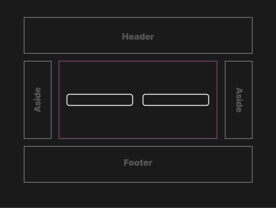
In this case, we're not merely checking the viewport width, but the viewport width minus two aside elements.
You might argue that @container (container query) is the ideal solution here, much like @container, both the Flexbox and CSS Grid examples are agnostic of viewport width.
The Flexbox version is appealing due to its simplicity, as there's less to consider, and it's always nice to have options! However, when I add more content, you may find that Flexbox doesn't suit your needs.
When I add more content to the CSS Grid example I get new items in neat columns:
...while Flexbox fills the available space like water: 💦
I don't think I've ever found a use-case like that last example, and I only use @media as a last-resort, therefore my preference here is the CSS Grid example.
Simple layouts
When it comes to simple, 1 column layouts, there's not much between the next two examples, apart from an extra line of code in the Flexbox example.
As you can see, with Flexbox all you need to do is change the value of flex-direction to column.
With CSS Grid, the default behaviour is to allocate content into rows, so all you have to do is declare: display: grid.
Complex layouts
Holy Grail
The Holy Grail layout, though a cliché, is widely used and serves as an excellent example. For completeness, the following Holy Grail examples also include footers that are anchored to the bottom of the viewport.
The CSS Grid example showcases its simplicity, as it requires minimal markup to control the layout.
I defined three columns and three rows, with the header and footer explicitly spanning all three columns.
The other elements are implicitly placed into columns. Since the second row is set to 1fr, the content within it occupies the remaining space between the header and footer, pushing the footer to the end of the container.
Achieving the same layout with Flexbox requires additional markup, as seen in the code playground.
At the beginning of this guide, I mentioned that Flexbox is one-dimensional, while CSS Grid is two-dimensional. Comparing the previous two examples clearly demonstrates these differences, necessitating extra markup which essentially serves as a row, in the Flexbox example. I prefer to control the entire layout within a single ruleset, instead of scattering pieces of it across various elements, which is why I prefer the CSS Grid example.
Conclusion
It's important not to be too critical of Flexbox in this context, as being explicit and wrapping the aside and main elements within another element (as demonstrated in the Flexbox example) can simplify development and offer greater control. However, doing so would not effectively illustrate the power of CSS Grid.
If you have any suggestions as to how the examples can be made clearer, easier to understand, or how I can add any missing use-cases you feel would help others, I'd love nothing more than to hear from you! Reach out to me on Twitter, or shoot me an email.
Written by Morgan Feeney
I’ve been designing and developing for almost 2 decades.
Read about me, and my work.
For juicy tips and exclusive content, subscribe to my FREE newsletter.
