Container Queries vs. Media Queries Part 1

Introduction
In this guide I recreate an example from the wild: the BBC News Homepage. I'll use this to demonstrate how card components controlled with media queries can be modernised to use container queries instead.
If you can't wait to see working examples, jump to the end where you can find links to them.
Why cards?
Cards are practical, modular, can be componentized, and have many applications:
- Homepages
- Recent posts components
- Category/Archive pages
- Product List Pages (PLP)
They're essential building blocks for most websites.
Where you'll find cards being used
Cards are used everywhere from eCommerce stores such as Amazon and tech blogs like TechCrunch, to publications such as BBC News and streaming platforms like Netflix, they're everywhere!
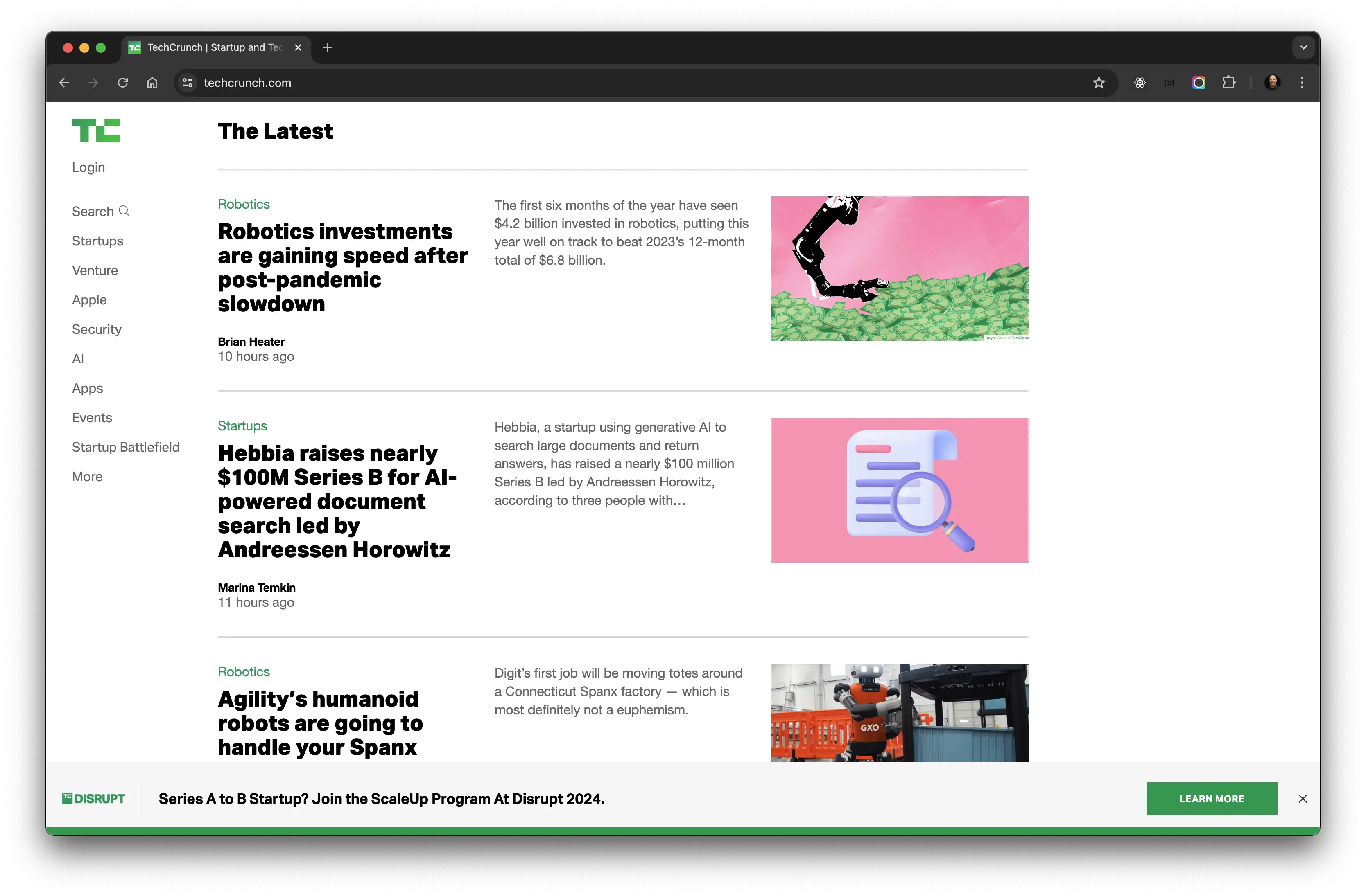
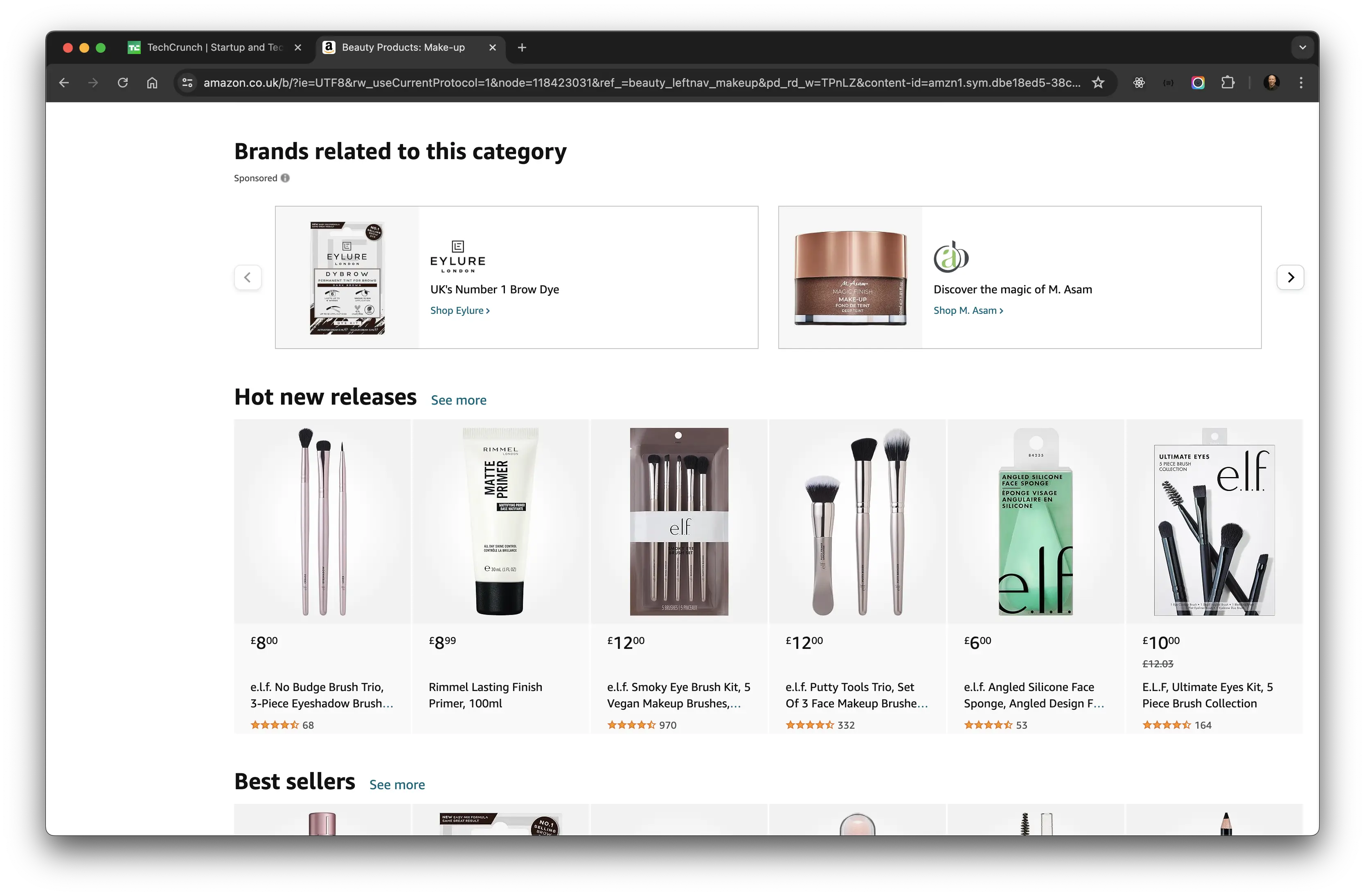
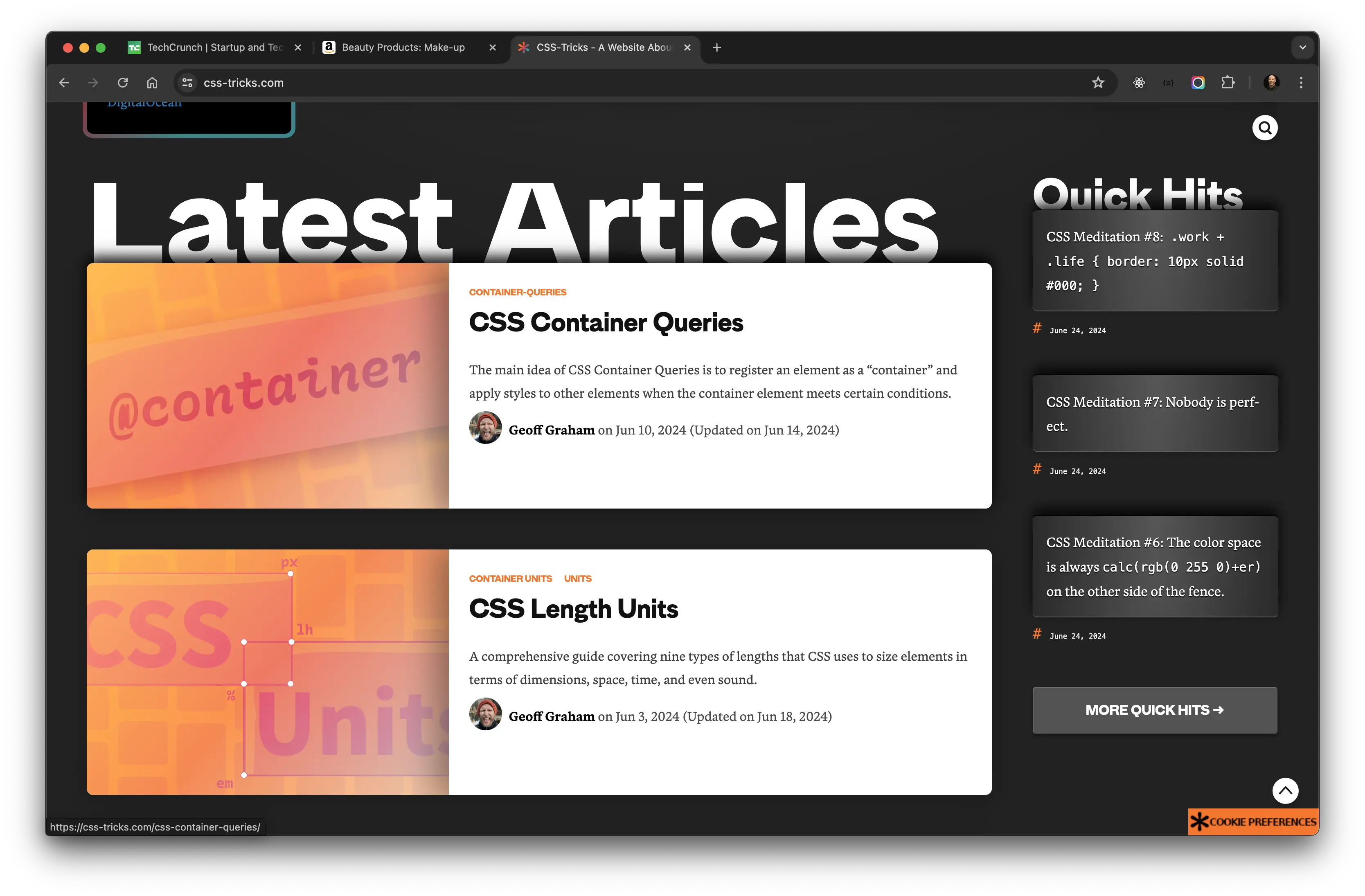
BBC News Homepage
BBC News have used the current homepage layout for a number of years. It's always been grid-based, made use of white-space, consisted of mainly card components and held together by a grid.
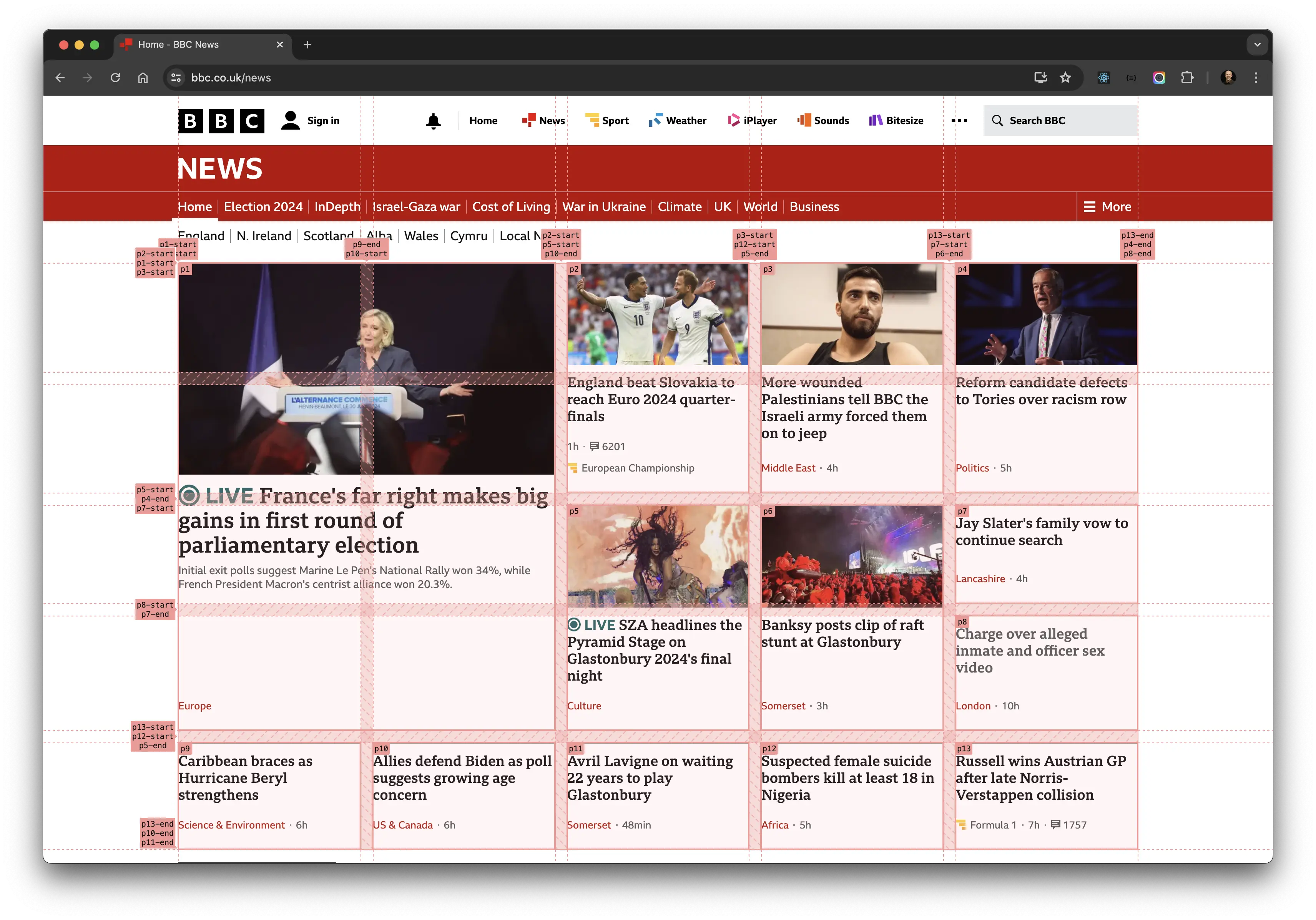
The design consists of a series of different sized cards, let's call them Regular Card and Promo Card, that span different numbers of rows and columns at each breakpoint, that also feature images:
There are three major breakpoints, and four layouts.
Inspection time
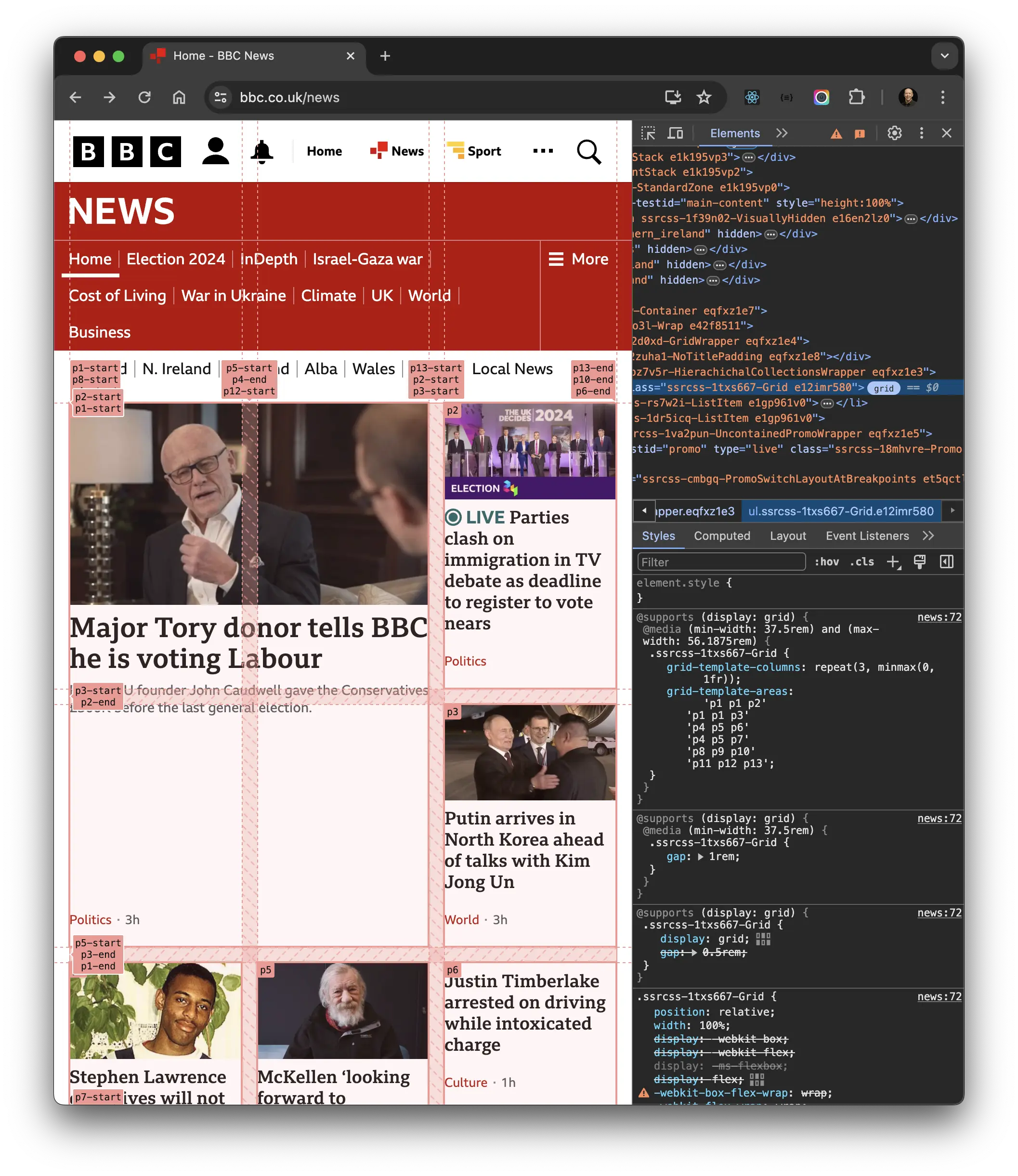
I highlighted the grid using Chrome's built in grid inspector below, I took note of the use of white-space, and how the cards occupy specific numbers of rows and columns across all breakpoints.
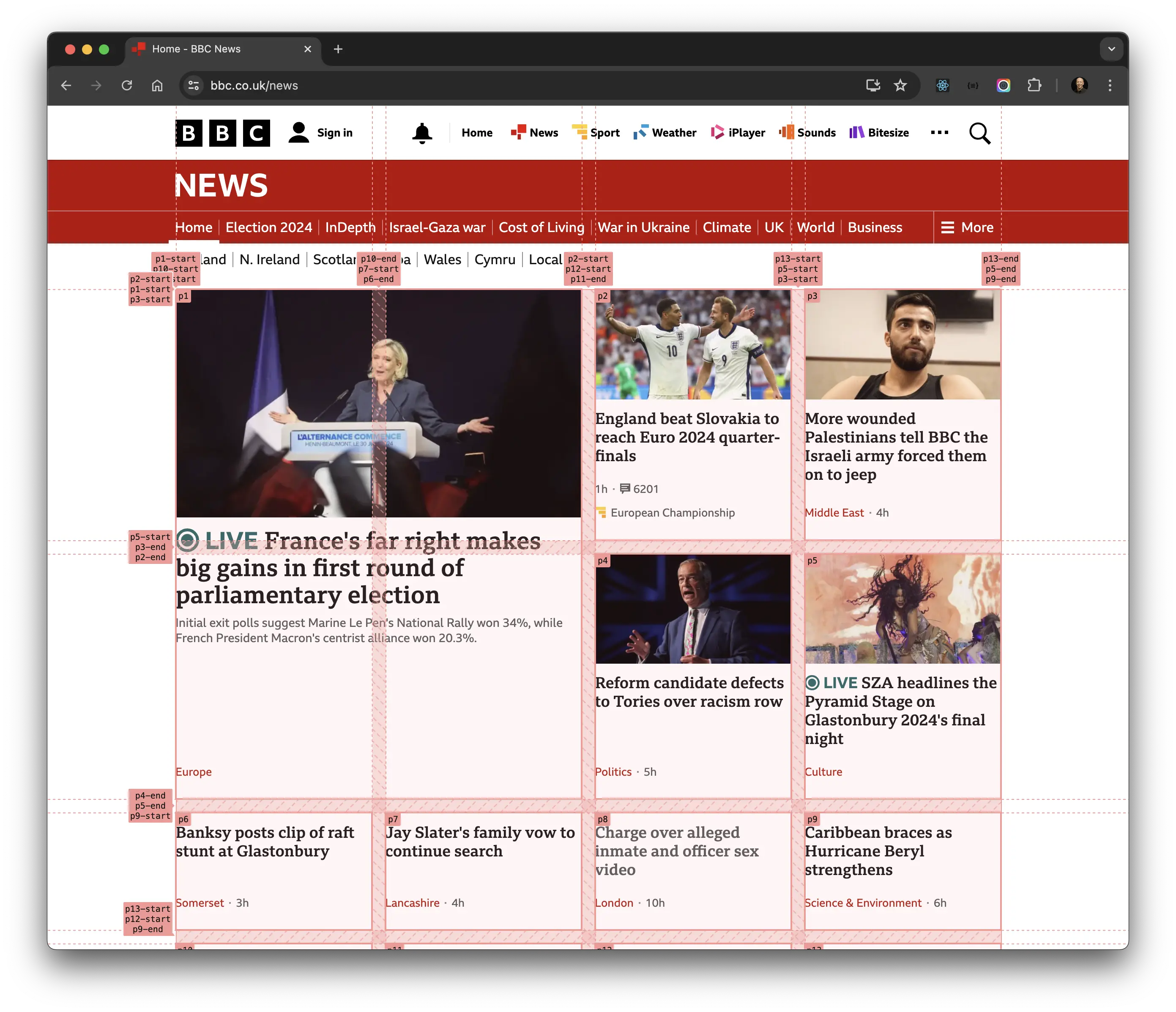
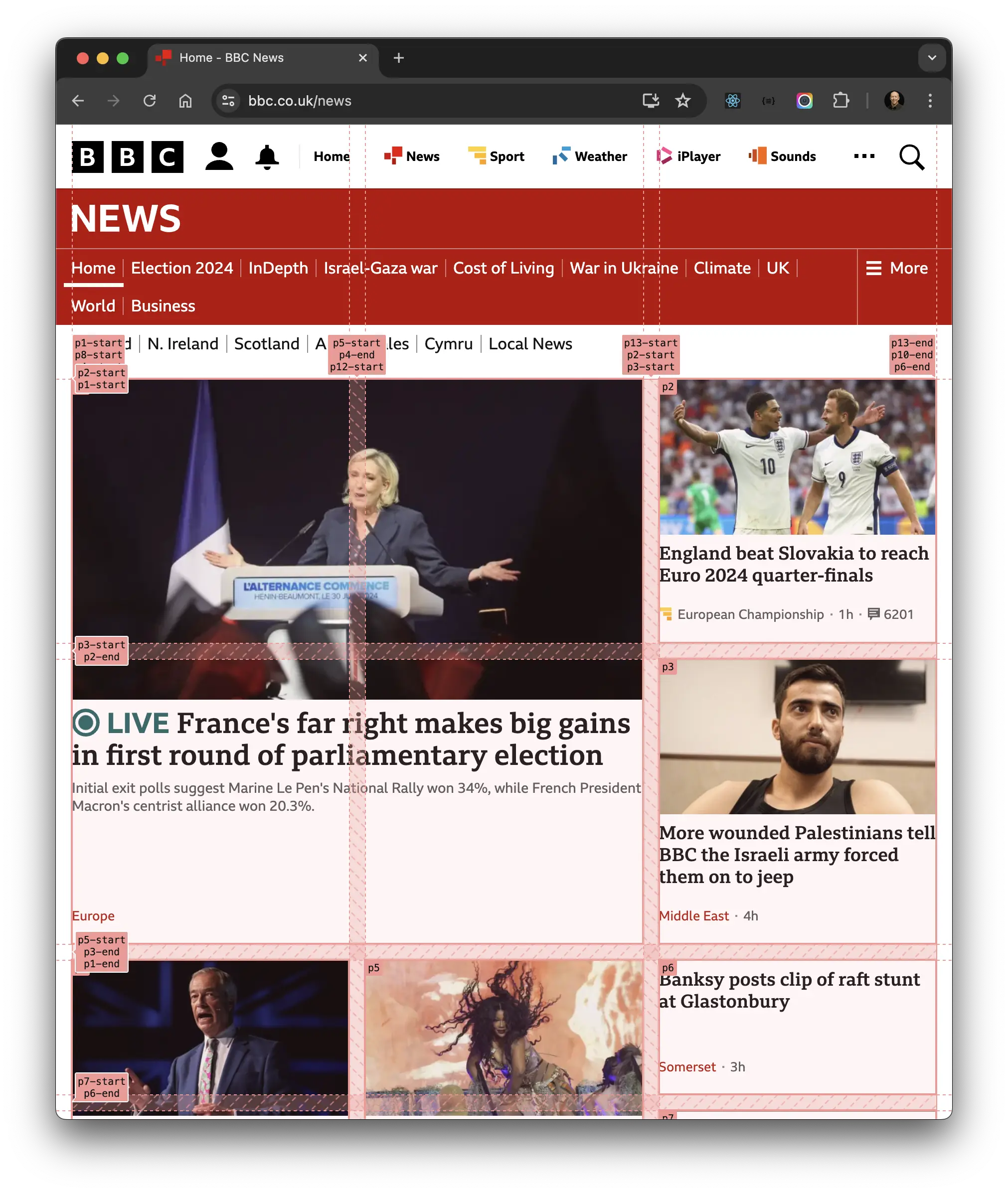
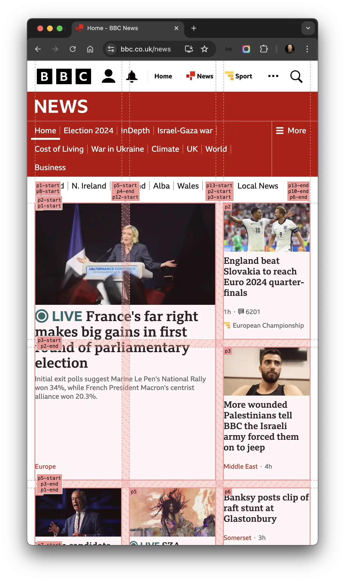
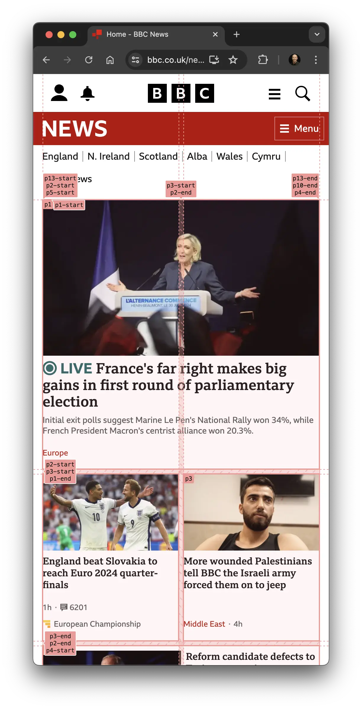
Now I have an understanding of how this page works, it's time to make my fingers dance—writing HTML and CSS to re-create this classic.
Recreating BBC News with container queries
To recreate a version of the BBC News homepage using container queries, I start with the grid. It consists of two columns (smallest breakpoint), then three, four, and finally; five columns (largest breakpoint).
.grid-container {
  margin: auto;
  display: grid;
  grid-template-columns: repeat(2, minmax(0, 1fr));
  gap: var(--gap);

  /* 37.5rem: 600px */
  @media (min-width: 37.5rem) {
    grid-template-columns: repeat(3, minmax(0, 1fr));
  }

  /* 63rem: 1008px */
  @media (min-width: 63rem) {
    grid-template-columns: repeat(4, minmax(0, 1fr));
    max-width: 63rem;
  }

  /* 80rem: 1280px */
  @media (min-width: 80rem) {
    grid-template-columns: repeat(5, minmax(0, 1fr));
    max-width: 80rem;
  }
}
You may be thinking where are the container queries?
For anything relating to the viewport, media queries are the right tool for the job, container queries are best applied to components placed on the grid. The previous code focuses on the viewport, that's why there are no container queries—card components on the other hand should use them.
Card components
Here's the initial Regular Card component:
.card {
  display: grid;
  grid-row: span 2;
  grid-template-rows: auto 1fr;
  gap: var(--gap);
  align-content: start;
  container-type: inline-size;

  img {
    aspect-ratio: var(--aspect-ratio);
    object-fit: cover
  }
}I thought about consolidating the large and small cards into a single component—using a single container query for font-size—but soon realised that each card requires specific font-sizes.
The font sizes are as follows:
:root {
  --font-size-title: 1rem; /* 16px */
  --font-size-title-lg: 1.125rem; /* 18px */
  --font-size-promo-title: 1.5rem; /* 24px */
  --font-size-promo-title-lg: 1.75rem; /* 28px */
}
BBC News use media queries to change font-size at certain breakpoints, e.g.
.card-title {
  font-size: var(--font-size-title);

  @media (min-width: 37.5rem) {
    font-size: var(--font-size-title-lg);
  }
}
What's confusing with that approach is the font sizes used in the cards change based on viewport width, because of this the text looks way too big for the space it occupies. The text wrapping onto multiple lines in the Regular Cards increases the height of the Promo Card, and now the supporting text (the word Politics) in it appears to belong to the section below it, breaking the rule of proximity.
This is where using container queries would make sense.
So, how do we use container queries instead?
First, we need to know the size of the containers: I estimated Regular Card's smallest width at 160px and largest width at 280px, whereas Promo Card's smallest width was 300px while it's largest width was 580px.
If we follow the approach used with media queries but use the container widths for the queries, we could do something like the following:
.card-title {
  font-size: var(--font-size-title);

  /* The width would be the container width, not the viewport this time */
  @container (min-width: 300px) {
    font-size: var(--font-size-title-lg);
  }
}
But at what point do you specify when the font-size changes?
This is where fluid typography is the right tool for the job as it will derive the font-size based on the distance between the two widths, and as long as you have those widths, and font-sizes, the correct values will be calculated.
To help make life easier, and eliminate guesswork for the calculations needed for fluid typography in conjunction with container queries, I used Utopia's clamp calculator.
Based on the output from those calculations we end up with these generated custom properties:
:root {
  --fluid-16-18: clamp(1rem, 0.8333rem + 1.6667cqi, 1.125rem);
  --fluid-24-28: clamp(1.5rem, 1.2321rem + 1.4286cqi, 1.75rem);
  --font-size-title: var(--fluid-16-18);
  --font-size-promo-title: var(--fluid-24-28);
  ...
}Which can be applied using font-size:
.card {
  display: grid;
  grid-row: span 2;
  grid-template-rows: auto 1fr;
  gap: var(--gap);
  align-content: start;
  container-type: inline-size;

  img {
    aspect-ratio: var(--aspect-ratio);
    object-fit: cover
  }
}

.card-title {
  font-weight: bold;
  font-size: var(--font-size-title);
}And finally, I re-use the previous styles and override them for the larger Promo card:
.card-promo {
  grid-column: span 2;
  grid-row: span 4;

  .card-title {
    font-size: var(--font-size-promo-title);
  }
}
Here's the result of applying container queries and fluid-typography to similar content, and the exact same layout from BBC News:
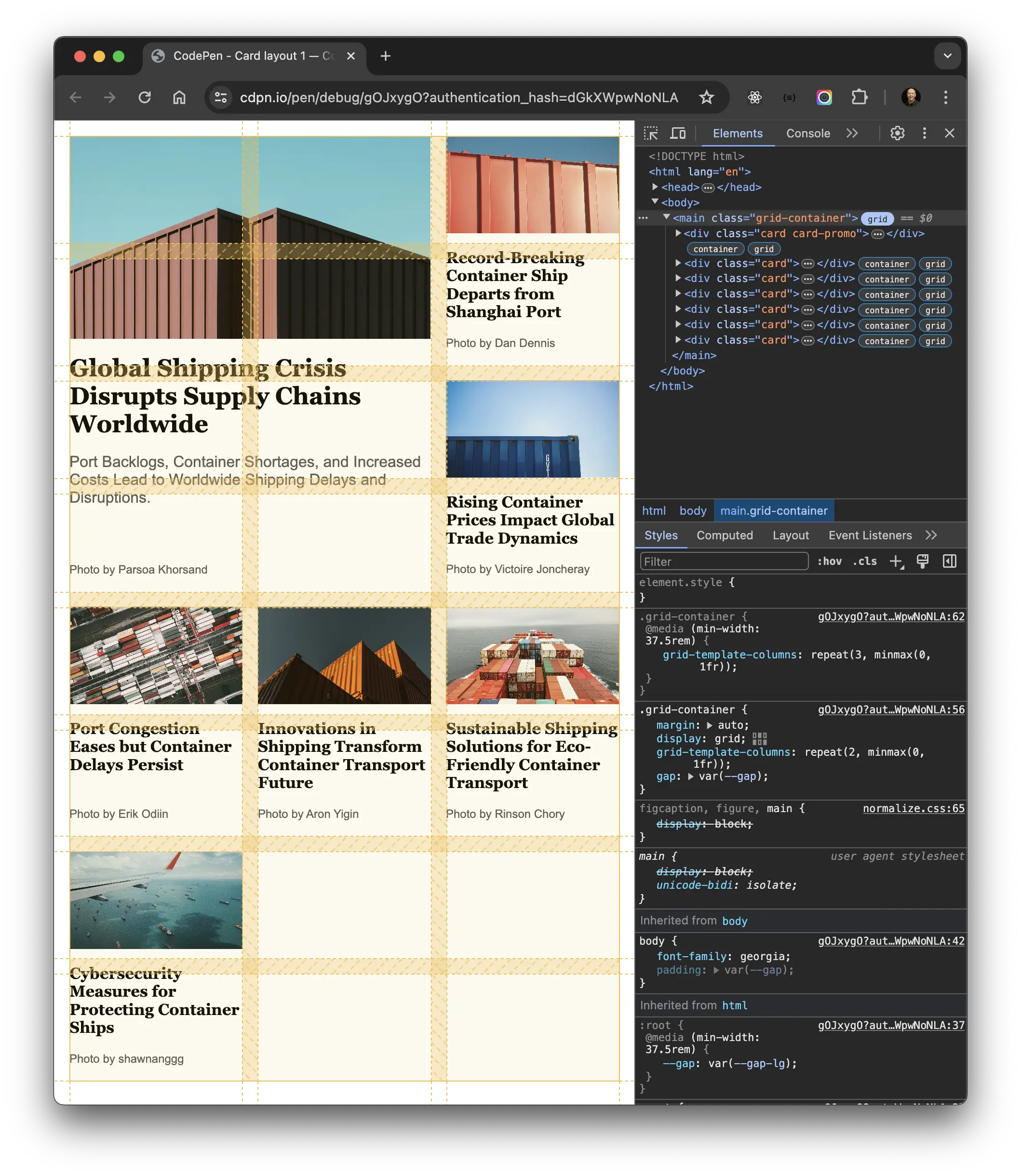
Note how the height of the promo card is no longer an issue, neither are the font-sizes. All cards adhere to the very strict grid, the layout looks pleasing, and we haven't broken the rule of proximity.
Applying container queries to the BBC News Homepage
I know the example isn't exactly like-for-like, so to make things fairer I applied the container queries and fluid typography from this guide to the BBC News Homepage using Chrome devtools, here's a video of me toggling the styles I apply on and off:
It may not look significant, but when you consider the volume of content this will make a big difference to the amount of screen-real-estate taken up, whilst improving the aesthetics.
Style queries
The BBC news homepage is deceptively simple. You may have noticed with the mobile layout a completely different look-and-feel on some cards, the layout changes from portrait to landscape, and a border is used to separate neighboring cards.
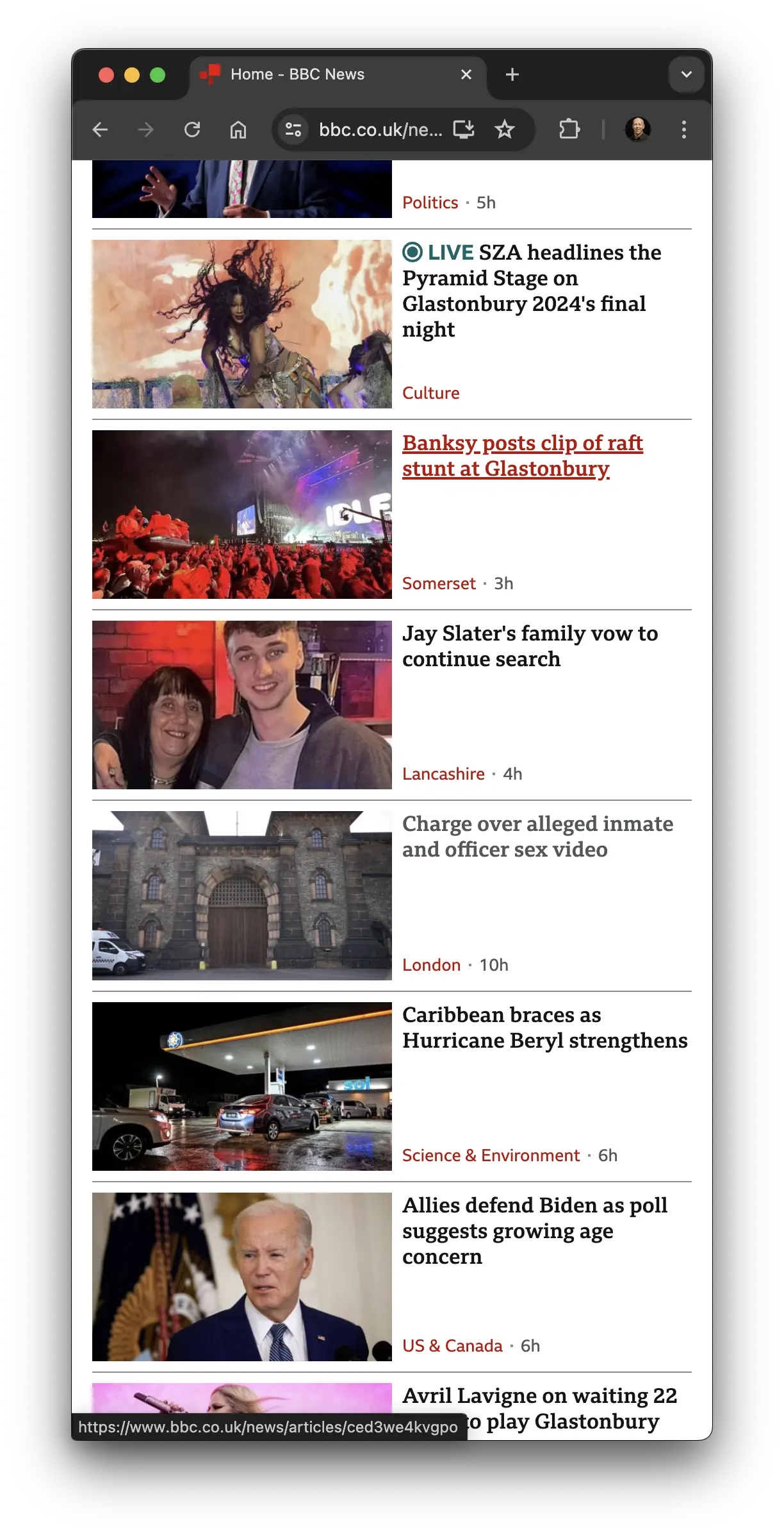
This is a great candidate for style queries! I was planning to do it like this:
- Create a card component
- Add container queries and fluid typography
- Use a style query to apply a 2 column, landscape layout with a border when the card spans 2 columns 👇
@container style(grid-column: span 2) {
  .card {
    --gap: 0.5rem;
    border-top: 1px solid #8A8C8E;
    padding-top: 0.5rem;
    grid-template-columns: 1fr 1fr;
    grid-template-rows: 1fr;

    .card-meta {
      padding: 0;
    }
  }
}At the time of writing this isn't possible due to style queries only having "partial" support, AKA supporting custom properties, learn more.
I did create a working example that is kind of close, but relies on media queries.
Conclusion
Container queries have been talked about for what seems like ages, they're one of the most requested CSS features of all time. Now they've landed in all major browsers there's a small learning curve to get up to speed with what's possible now. I highly recommend getting to grips and even if you just add them to one component to start with, you'll begin to reap the benefits.
Comparing to the BBC
Using container queries drastically reduces the number of media queries needed, to get a taste of what I mean, view the BBC News' stylesheet and see the amount of combined min and max width media queries that are used and you may be surprised.
Working examples
If you have any suggestions as to how the examples can be made clearer, easier to understand, or how I can add any missing use-cases you feel would help others, I'd love nothing more than to hear from you! Reach out to me on Twitter, or shoot me an email.
Written by Morgan Feeney
I’ve been designing and developing for almost 2 decades.
Read about me, and my work.
For juicy tips and exclusive content, subscribe to my FREE newsletter.
