Responsive CSS Grids, Two Ways

Introduction
Looking for a quick way to roll your own responsive CSS Grid? Look no further. This guide provides two simple ways to create them, no frameworks required; only CSS.
For completeness, there are examples with CSS nesting, and without.
With media queries
Start by creating the HTML:
<div class="grid-container">
  <div class="grid-item">One</div>
  <div class="grid-item">Two</div>
  <div class="grid-item">Three</div>
  <div class="grid-item">Four</div>
  <div class="grid-item">Five</div>
  <div class="grid-item">Six</div>
  <div class="grid-item">Seven</div>
  <div class="grid-item">Eight</div>
  <div class="grid-item">Nine</div>
  <div class="grid-item">Ten</div>
  <div class="grid-item">Eleven</div>
  <div class="grid-item">Twelve</div>
</div>
You need what's known in the trade as a grid container, my grid container is this: <div class="grid-container">.
The children contained within the grid container are known as grid items.
You can name them anything you like, the CSS is not dependent on the names.
Now write the initial CSS:
.grid-container {
  display: grid;
  gap: 1rem;
}

.grid-item {
  color: white;
  background: rebeccapurple;
  padding: 1rem;
}
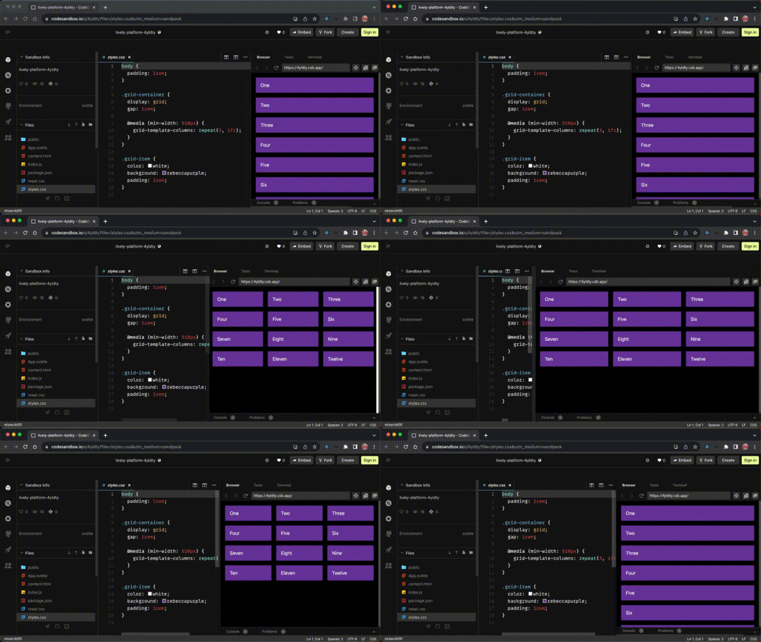
Unless you specify grid-template-columns the grid items will be stacked on top of each other:
The best approach is mobile-first, so let's utilise this default behaviour where all the columns are 100% of the viewport width, and add a min-width: 510px media query where it makes sense.
By doing this, we tell the browser that if the device's screen is bigger than 510px to change the number of columns.
Here's the end result:

To add another media query, just repeat this step, but remember that it's good practice to keep media queries in cascade order (top to bottom).
I nested the media queries, if you don't want to use nested CSS you simply wrap each declaration in a @media rule, like so:
body {
  padding: 1rem;
}

.grid-container {
  display: grid;
  gap: 1rem;
}

@media (min-width: 510px) {
  .grid-container {
    grid-template-columns: repeat(3, 1fr);
  }
}

@media (min-width: 600px) {
  .grid-container {
    grid-template-columns: repeat(6, 1fr);
  }
}

.grid-item {
  color: white;
  background: rebeccapurple;
  padding: 1rem;
}
If you want to add images, checkout this example: Images in a 12-column grid
With auto-fit
If media queries are not for you, there's another option;
it's a combination of CSS Grid,
the repeat() CSS function and the auto-fit keyword.
Take the HTML from the first step, and add the following CSS:
.grid-container {
  display: grid;
  gap: 1rem;
  grid-template-columns: repeat(auto-fit, minmax(300px, 1fr));
}

.grid-item {
  color: white;
  background: rebeccapurple;
  padding: 1rem;
}
What you get is a solution with no media queries, which means less code, and it's completely up to the browser to decide when to change things.
Note the value I used is 231px, does it seem random? It's not, it's actually the width of the column when using the media query min-width: 510px minus the padding on the body and the grid gap, e.g. (1rem * 2 + 1rem + 510px) / 2)
This solution works very well with container queries, and that brings up a really important problem that I want to highlight.
There's a potential bug in this code
There are a lot of articles on the topic of using auto-fill
and minmax() that claim to provide a responsive solution,
but they're all somewhat flawed.
The bug is to do with fluidity and overflow,
as long as you never go below the minimum value used in the minmax() function,
which in the previous example is 231px, you'll never see it.
That's a pretty safe bet
if you're using this a drop-in replacement for media queries,
isn't it?
They seem to use a low number like 240px because of this reason,
they assume that the smallest screens are 320px,
and unless you're building a responsive layout for a watch, I agree.
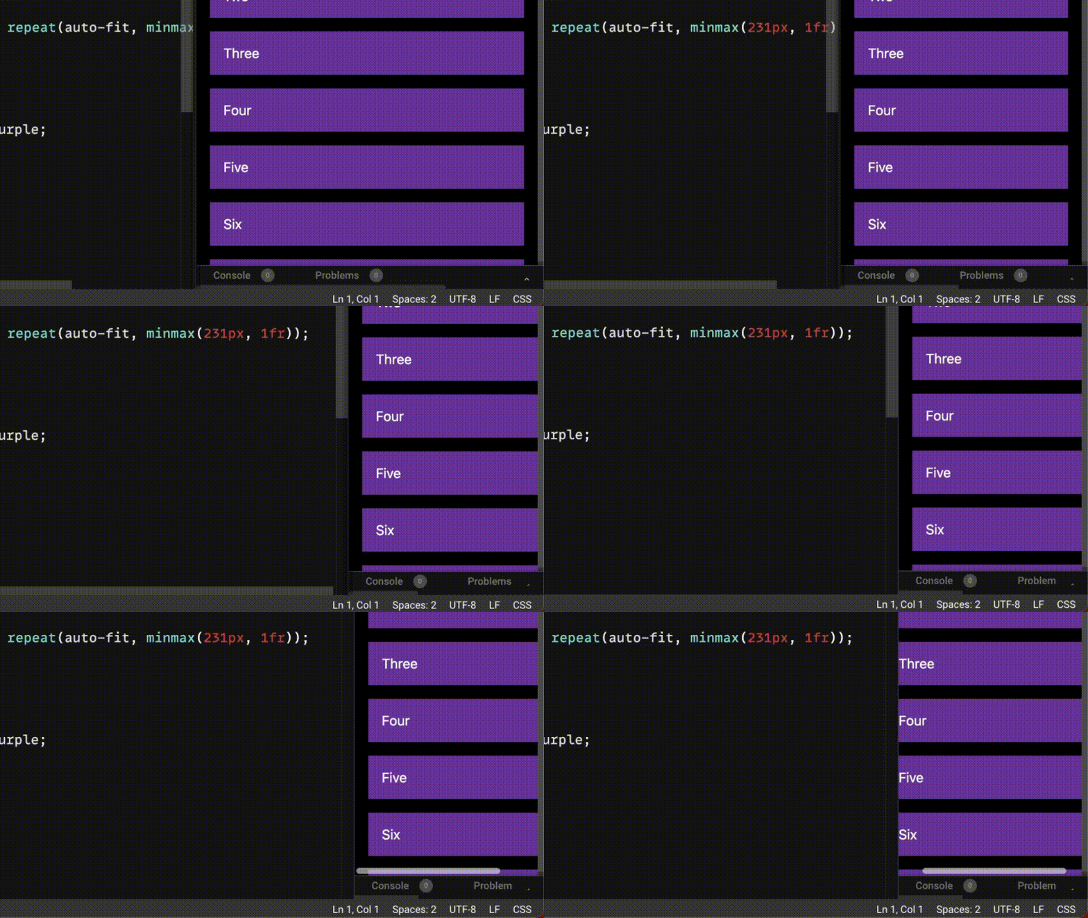
But let's be honest about calling it what it is, a solution, and not ignoring the fact that these examples are not 100% fully responsive and turning a blind eye. If you go below the lowest value, the content will overflow:

I was never happy knowing that this kind of solution could be discovered by a user, or god forbid, a tester.
The one thing they're all missing is this:
.grid-container {
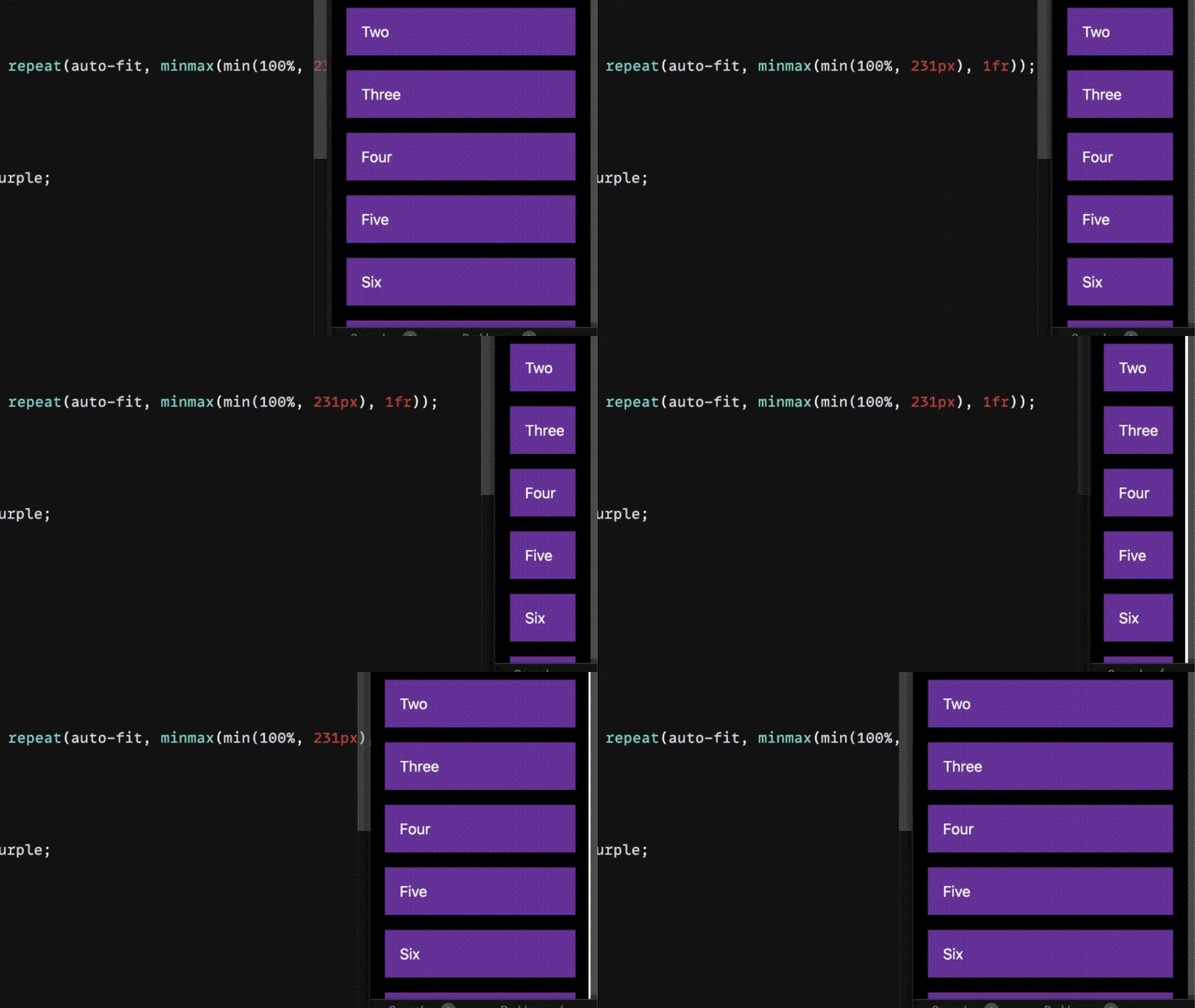
  grid-template-columns: repeat(auto-fit, minmax(min(100%, 231px), 1fr));
}
In conjunction with minmax(), using min(100%, 231px) tells the browser to pick the lowest value, which is either 100% or 231px, if you go below 231px, 100% is used, which makes things fluid again.

Not only is this solution complete, it also works with container queries.
Conclusion
There are advantages and disadvantages to either approach, with media queries you have total control of the breakpoints, and you won't have to get your calculator out to determine the width of the grid-items.
Using auto-fit or auto-fill gives a tremendous amount of flexibility and in most cases is an ideal pairing with @container queries.
If you're using auto-fit or auto-fill as a drop-in replacement for @media, just use a media query, they do different things.
If you have any suggestions as to how the examples can be made clearer, easier to understand, or how I can add any missing use-cases you feel would help others, I'd love nothing more than to hear from you! Reach out to me on Twitter, or shoot me an email.
Written by Morgan Feeney
I’ve been designing and developing for almost 2 decades.
Read about me, and my work.
For juicy tips and exclusive content, subscribe to my FREE newsletter.
