Laying out Content with CSS Grid and Subgrid

Introduction
This guide is all about taking your 12 column grid and content, and skillfully combining them. CSS Grid has a few quirks, I'll focus on how to overcome them with tips on how to structure your code, and walk through a range of different techniques for applying CSS Grid to layouts.
To wrap things up there's also a section on the long-awaited subgrid.
This Guide is a work in progress, and is a follow up to How to Create Your Own CSS Grid, Grid System, where I go into detail about 12 column grid systems.
Images in a 12 column grid
The following images are implicitly placed into columns—I don't specify where I want an image to go—they're laid out based on source order.
body {
  padding: 1rem;
}

.grid {
  display: grid;
  grid-template-columns: repeat(12, 1fr);
  gap: 1rem;
}

h1 {
  grid-column: 1 / span 12;
}

img {
  max-width: 100%;
  height: auto;
}
Did you notice the following code?
img {
  max-width: 100%;
  height: auto;
}Without this bit of CSS, the images would have the final say on how our grid behaves. CSS Grid, by default, respects the original size of content unless we tell it otherwise.
Images that span columns and rows
The natural size of each image is 200px x 200px, the code above (Fig. 2) ensures images are constrained within each grid column, and because of the dimensions of each image we also get a uniform layout.
We can take advantage of the implicit nature of CSS Grid by changing the dimensions of some images, the layout will appear to adjust itself to accommodate the change.
body {
  padding: 1rem;
}

.grid {
  display: grid;
  grid-template-columns: repeat(12, 1fr);
  gap: 1rem;
}

img:nth-of-type(4n + 6) {
  grid-column: span 2;
  grid-row: span 2;
}

h1 {
  grid-column: 1 / span 12;
}

img {
  max-width: 100%;
  height: auto;
}
We could change all the images to appear larger by applying css to an element selector or a generic class.
body {
  padding: 1rem;
}

.grid {
  display: grid;
  grid-template-columns: repeat(12, 1fr);
  gap: 1rem;
}

img {
  grid-column: span 2;
  grid-row: span 2;
}

h1 {
  grid-column: 1 / span 12;
}

img {
  max-width: 100%;
  height: auto;
}
Combining text and images
Let's add a title and body text related to the images in our layout. I won't introduce any additional markup to contain the separate sections of text and images, this will demonstrate the flow of content based on the CSS applied to it in combination with neighboring elements.
body {
  padding: 1rem;
}

.grid {
  display: grid;
  grid-template-columns: repeat(12, 1fr);
  gap: 1rem;
}

img {
  grid-column: span 1;
  grid-row: span 1;
}

img:nth-of-type(3n + 3) {
  grid-column: span 2;
  grid-row: span 2;
}

h1 {
  grid-column: span 12;
}

p {
  margin: 0;
}

article {
  display: grid;
  align-content: start;
  gap: 1rem;
  grid-column: span 6;
  grid-row: span 13;
}

img {
  max-width: 100%;
  height: auto;
}
In the previous example I'm relying on source order, I use a combination of the span keyword on <article> and also apply span to the images to control the layout.
The <h1> explicitly spanning 12 columns is holding things together, if you remove the CSS from it (use the playground) you'll see changes due to the heading being implicitly added to the columns.
Doe to <article> spanning 6 columns, 13 rows, and coming in before the <img> in the source, the text is aligned nicely against the start of the grid and forces the images over by 6 columns.
Working like this allows a great level of flexibility, but is complex and fragile, and would probably confuse anyone that inherits or has to work with this kind of thing.
What if you don't want to specify the exact number of rows for the article to span, it would be great if it could do that without having to add a specific track number.
Unfortunately the following doesn't work for this case:
article {
  grid-row: 1 / -1
}
Numeric indexes in the grid-placement properties count from the edges of the explicit grid. Positive indexes count from the start side (starting from 1 for the start-most explicit line), while negative indexes count from the end side (starting from -1 for the end-most explicit line).
The key thing to note here is the difference between implicit and explicit, when using either auto-fill or auto-fit in a repeat() function it makes whatever you apply it to implicit, which means you have to specify the exact number of columns or rows you want to span, which is probably not what you want to do anyway if you chose to use an implicit grid.
The simplest way around this is to add a wrapper around the text, or around each section.
Using wrappers to control the layout
Well done for making it this far, you'll now be able to breath a sigh of relief to find out how to tame this layout using a very simple approach.
body {
  padding: 1rem;
}

.grid {
  display: grid;
  grid-template-columns: repeat(12, 1fr);
  gap: 1rem;
}

.body-wrapper {
  display: grid;
  gap: inherit;
  grid-column: 1 / span 6;
}

.image-wrapper {
  display: grid;
  grid-template-columns: repeat(6, 1fr);
  gap: inherit;
  grid-column: 7 / span 6;
  align-content: start;
}

img {
  grid-column: span 1;
  grid-row: span 1;
}

img:nth-of-type(3n + 3) {
  grid-column: span 2;
  grid-row: span 2;
}

p {
  margin: 0;
}

h1 {
  grid-column: span 12;
}

img {
  max-width: 100%;
  height: auto;
}
In this penultimate example there's no need
to worry about specifying how many rows to span,
and if you remove the CSS from the heading the entire layout
won't fall to pieces,
this is due to the use of <div> in our container.
They both occupy the same row in our layout,
the height of the tallest element (the content) dictates the height of the row.
Applying subgrid
In the previous example I introduced wrappers,
which are simply <div> in this case but could be semantic elements such as <article> or <aside>.
The parent has a 12-column grid assigned to it.
Each wrapper spans 6 columns,
the image-wrapper has grid-template-columns property assigned to it.
.body-wrapper {
  grid-column: 1 / span 6;
}

.image-wrapper {
  grid-column: 7 / span 6;
  display: grid;
  grid-template-columns: repeat(6, 1fr);
}
You could do the following instead.
.image-wrapper {
  grid-column: 7 / span 6;
  display: grid;
  grid-template-columns: subgrid;
}
The number of explicit tracks in the subgrid in a subgridded dimension always corresponds to the number of grid tracks that it spans in its parent grid
I've applied subgrid to the following example.
Inspect it
using a browser
that supports subgrid to see the effects.
body {
  padding: 1rem;
}

.grid {
  display: grid;
  grid-template-columns: repeat(12, 1fr);
  gap: 1rem;
}

.body-wrapper {
  display: grid;
  gap: inherit;
  grid-column: 1 / span 6;
}

.image-wrapper {
  display: grid;
  grid-template-columns: repeat(6, 1fr);
  gap: inherit;
  grid-column: 7 / span 6;
  align-content: start;
}

@supports (grid-template-columns: subgrid) {
  .image-wrapper {
    grid-template-columns: subgrid;
  }
}

img {
  grid-column: span 1;
  grid-row: span 1;
}

img:nth-of-type(3n + 3) {
  grid-column: span 2;
  grid-row: span 2;
}

p {
  margin: 0;
}

h1 {
  grid-column: span 12;
}

img {
  max-width: 100%;
  height: auto;
}
I want all items—no matter how deeply nested they are—to align with the 12 columns on the parent;
especially image-wrapper, there can't be any overlap here, or I'll lose sleep.
To demonstrate what keeps me up at night (and how I prefer things)
check out the following images:
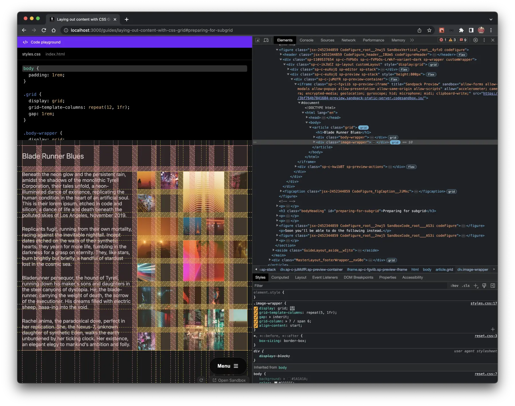
The image in Fig.11 demonstrates that when I toggled the grid inspector on both the parent grid and the subgrid there is a misalignment. This is because I mistakenly applied a 5 column grid, when it should have been 6. This kind of thing happens when you manually type the number of columns, and forget how many columns are in the subgrid you are working on.
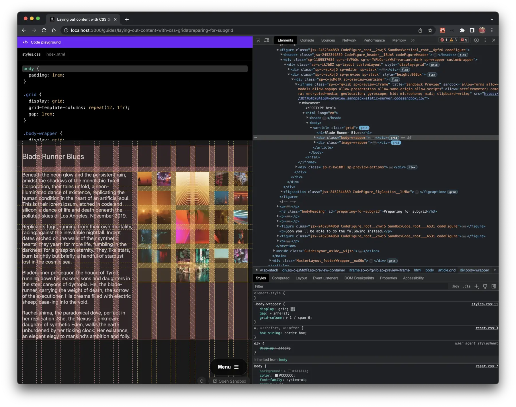
In Fig.12 the misalignment is no more,
subgrid interprets the number of columns
I span as the number of columns for its own grid.
Because support for grid-template-columns: subgrid isn't great,
I wrapped the rules for image-wrapper
in @supports, which checks
to see if the browser supports a CSS feature or not,
if it's not yet supported then the fallback is used instead.
@supports (grid-template-columns: subgrid) {
  .image-wrapper {
    grid-template-columns: subgrid;
  }
}
If you have any suggestions as to how the examples can be made clearer, easier to understand, or how I can add any missing use-cases you feel would help others, I'd love nothing more than to hear from you! Reach out to me on Twitter, or shoot me an email.
Written by Morgan Feeney
I’ve been designing and developing for almost 2 decades.
Read about me, and my work.
For juicy tips and exclusive content, subscribe to my FREE newsletter.