Responsive Product Cards with Container Queries and CSS Grid

Introduction
This guide teaches you
to build a single product card component
that automatically adjusts its look based on its width,
using container queries.
This replaces the need for two separate components.
We will use auto-fill for layout control and container queries for component adjustments,
the perfect combination.
Example
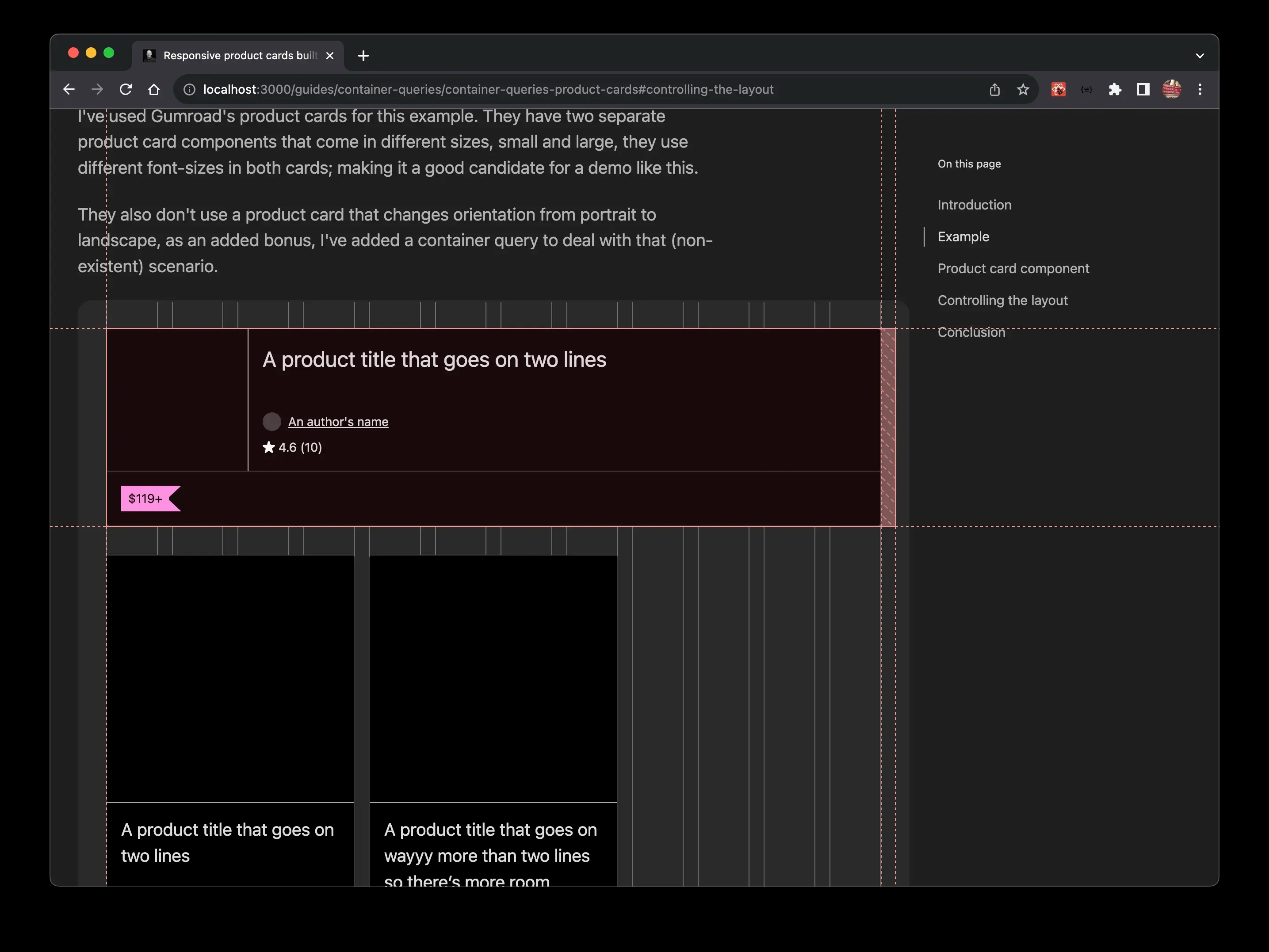
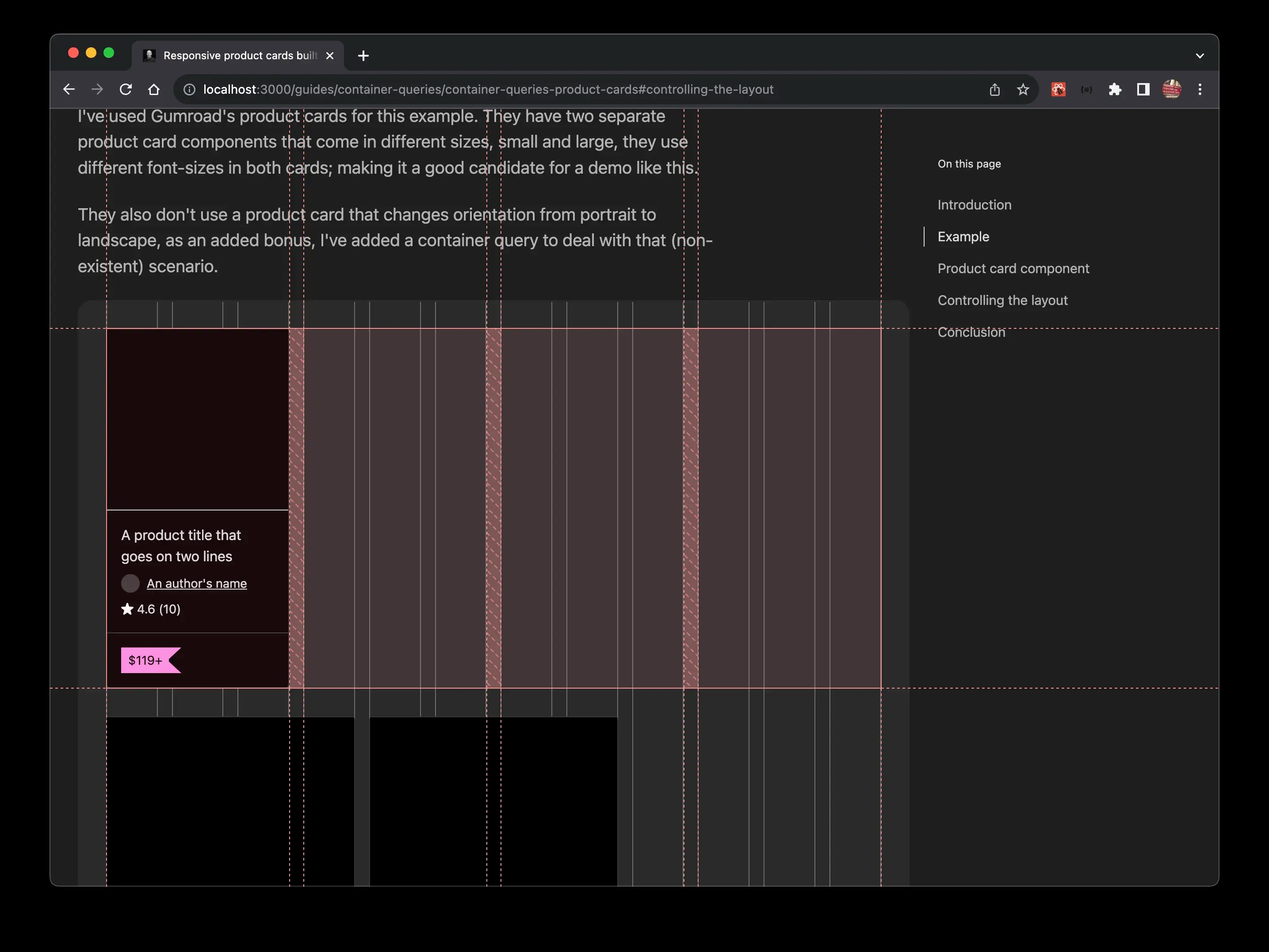
In this example, I utilised Gumroad's product cards, which are available in two different sizes: small and large, each using distinct font sizes. This makes them a suitable choice for our demonstration.
Although they don't offer a product card that can switch between portrait and landscape orientations, I've enhanced our version with a container query to handle this potential scenario.
A product title that goes on two lines
4.6 (10)
A product title that goes on two lines
4.6 (10)
A product title that goes on wayyy more than two lines so there’s more room
4.6 (10)
A product title that goes on two lines
4.6 (10)
A product title that goes on two lines
4.6 (10)
A product title that goes on wayyy more than two lines so there’s more room
4.6 (10)
A product title that goes on for a bit
4.6 (10)
A product title that goes on wayyy more than two lines so there’s more room
4.6 (10)
Product card component
I'll talk through the code used to create the layout of the card, I won't go into the details of all the bits and pieces (e.g. the flag).
.card-container {
  container-type: inline-size;
  display: grid;
}

.card {
  grid-template-rows: auto 1fr auto;
  border-radius: 0.25rem;
  border: var(--border);
  background: var(--black);
  color: var(--color);
  display: grid;
  z-index: 2;

  :is(p) {
    line-height: 1.5;

    @container (min-width: 0) {
      font-size: clamp(var(--font-size-base), 8cqw, var(--font-size-lg));
    }
  }

  @container (min-width: 32.8125rem) {
    grid-template-columns: 10rem 1fr;
  }
}

.card-image {
  background: var(--black);
  aspect-ratio: 1 / 1;
  border-bottom: var(--border);

  @container (min-width: 32.8125rem) {
    border-right: var(--border);
    border-bottom: none;
  }
}

.card footer {
  border-top: var(--border);
  padding: var(--card-padding);
  display: grid;

  @container (min-width: 32.8125rem) {
    grid-column: span 2;
  }
}

.card header {
  container-type: inline-size;
  display: grid;
  gap: 0.5rem;
  padding: var(--card-padding);
  grid-template-rows: 1fr auto auto;
}<article class="card-container">
<div class="card">
<div class="card-image"></div>
<header>
<p class="card-title">A product title that goes on for a bit</p>
<p class="author">
<span class="circle" />
An author's name
</p>
<div class="reviews">
<Icon />
<p class="count">4.6 (10)</p>
</div>
</header>
<footer>
<div class="price gumroadPrice">$119+</div>
</footer>
</div>
</article>Container queries are essential when you want to design self-sufficient components that can modify their layout. It is vital to enclose the component in an element because a container cannot query itself; it can only query its children.
For the example,
I wrapped the component in an <article /> HTML element
and assigned it a card-container class.
.card-container {
  container-type: inline-size;
  display: grid;
}
In our setup, we have two main container queries:
Font size adjustment
The initial query alters the font size of all <p/> elements according to the container's width. Currently, the query width is set to 0, but for a finer approach, for instance if I was implementing this for Gumroad, you could establish a default width and then modify it through the container query settings.
Layout control
This is managed by the second container query, highlighted below.
.card {
  grid-template-rows: auto 1fr auto;
  border-radius: 0.25rem;
  border: var(--border);
  background: var(--black);
  color: var(--color);
  display: grid;
  z-index: 2;

  :is(p) {
    line-height: 1.5;

    @container (min-width: 0) {
      font-size: clamp(var(--font-size-base), 8cqw, var(--font-size-lg));
    }
  }

  @container (min-width: 32.8125rem) {
    grid-template-columns: 10rem 1fr;
  }
}
Caution
Always test the effectiveness of using cqw units for font-size by zooming (using ctrl + / -).
The only other layout change is the footer.
.card footer {
  border-top: var(--border);
  padding: var(--card-padding);
  display: grid;

  @container (min-width: 32.8125rem) {
    grid-column: span 2;
  }
}
The units I've used are arbitrary,
e.g. 32.8125rem just came about by resizing the window
and seeing how many cards I can fit onto a single row.
8cqw came about by seeing what sizes the text was at different screen widths,
you can get more granular if you want.
That's all there is to the CSS for three card components using container queries 🚀.
Controlling the layout
All the cards will look identical until they are applied to a grid, so there are a few more lines of code to write!
.grid-small {
  display: grid;
  grid-template-columns: repeat(auto-fill, minmax(min(100%, 11rem), 1fr));
  gap: 1rem;
}

.grid-large {
  display: grid;
  grid-template-columns: repeat(auto-fill, minmax(min(100%, 16rem), 1fr));
  gap: 1rem;
}

.grid-largest {
  display: grid;
  gap: 1rem;
}<div class="grid-small">...</div>
<div class="grid-large">...</div>
<div class="grid-largest">...</div>For our product card layouts,
it's better to use auto-fill rather than auto-fit.
Using auto-fill ensures that cards only take up necessary space
and don't stretch to fill extra columns,
preserving the distinct appearance of each card.
In contrast, auto-fit would stretch the cards to fit, occupying all available space,
which is not desirable in this scenario
as we want each card to maintain its unique look.
Using auto-fill also ensures
images aren't blurry because they've been allowed to grow too large.
This works especially well with the bigger product cards, which would be huge without any measures in place to restrict their width.
Conclusion
In this guide, I showcased how just a small amount of code can yield a wide range of variations,
leveraging the capabilities of CSS Grid, auto-fill, and container queries.
I illustrated the influence of width on container queries and explained how a basic card component can function independently of its environment. Although one scenario might seem a bit fabricated, it was necessary to provide a worthy demonstration 😄.
If you have any suggestions as to how the examples can be made clearer, easier to understand, or how I can add any missing use-cases you feel would help others, I'd love nothing more than to hear from you! Reach out to me on Twitter, or shoot me an email.
Written by Morgan Feeney
I’ve been designing and developing for almost 2 decades.
Read about me, and my work.
For juicy tips and exclusive content, subscribe to my FREE newsletter.